Model adequacy
model_adequacy.RmdIt is trite, but nonetheless true (and very important) to remember that all models are wrong. There are more things in heaven and earth than are dreamt of in any model’s view of the world. Nonetheless, some models in some circumstances are useful.
Model adequacy is a broad umbrella for interrogating how well our model captures features of reality. If our model fails to adequately recapitulate features of the data which are important to our question, then it is unlikely to be giving us useful answers to our questions. For example, if our model cannot capture the average final chain size in our data, we should not trust its estimates of . But if our model can adequately capture important features of the data, we have reason to hope its inferences are useful (at least, with respect to those features).
The posterior predictive distribution
The posterior predictive distribution is the distribution on some quantity that we might expect to see in new datasets, given our fitted model. By comparing our model’s predictive distribution to the observed value, we can assess whether it is adequate or not. For example, if we compare the predictive distribution for the average final chain size, and find it does not match the average of our samples, our model is inadequate and untrustworthy.
A common workflow for using the posterior predictive to address adequacy is to simulate new datasets from the posterior predictive distribution, then summarize them to understand a specific quantity (or quantities) of interest. By looking at how it compares to our posterior, we can try to understand where our model may be missing reality. In so doing, we assess the model’s adequacy.
Censoring and conditioning present potential wrinkles. For simplicity, we will focus on models without censoring.
Our investigation here will start with the data on outbreaks of the pneumonic plague from “Advanced data.”
## Loading required package: StanHeaders##
## rstan version 2.32.7 (Stan version 2.32.2)## For execution on a local, multicore CPU with excess RAM we recommend calling
## options(mc.cores = parallel::detectCores()).
## To avoid recompilation of unchanged Stan programs, we recommend calling
## rstan_options(auto_write = TRUE)
## For within-chain threading using `reduce_sum()` or `map_rect()` Stan functions,
## change `threads_per_chain` option:
## rstan_options(threads_per_chain = 1)##
## Attaching package: 'dplyr'## The following objects are masked from 'package:stats':
##
## filter, lag## The following objects are masked from 'package:base':
##
## intersect, setdiff, setequal, union##
## Attaching package: 'tidyr'## The following object is masked from 'package:rstan':
##
## extract
pneumonic_plague_inf <- pneumonic_plague
pneumonic_plague_inf[4] <- Inf
fit_inf <- fit_nbbp_homogenous_bayes(
  all_outbreaks = pneumonic_plague_inf,
  condition_geq = rep(2, length(pneumonic_plague)),
  seed = 42,
  iter = 5000
)
We will skip examining the posterior, as it is exactly the same as before (we have set the same seed).
We will only use 100 samples here of the posterior predictive distribution for illustrative purposes. In general one uses all posterior samples.
In our simulations, we have to account for conditioning. That is, we have told the analytical model that the data was gathered in such a way as to ignore all chains of size 1. We should therefore also simulate only datasets without singletons. On the other hand, it might be interesting to know how many singletons the model predicts we did not include in the dataset. So, unconditional simulations could be useful too, for specific purposes, but we will start with conditional ones.
set.seed(42)

nchains <- length(pneumonic_plague_inf)
npred <- 100

posterior_predictive <- rstan::extract(fit_inf, pars = c("r_eff", "concentration")) |>
  as.data.frame() |>
  dplyr::rename(r = r_eff, k = concentration) |>
  dplyr::mutate(index = row_number()) |>
  filter(index %in% sample.int(10000, npred)) |>
  mutate(
    chain_size = purrr::map2(
      r, k, function(r, k) {
        chains <- NULL
        # Ensure we meet conditioning
        while (is.null(chains)) {
          # vectorization makes this draw cheap, we can be generous with drawing extra chains
          all_chains <- rnbbp(nchains * 100, r, k)
          conditioned <- all_chains[all_chains > 1]
          if (length(conditioned) >= nchains) {
            chains <- head(conditioned, nchains)
          }
        }
        return(chains)
      }
    )
  ) |>
  unnest(chain_size)
As we have just simulated entire new datasets, we will need to summarize them in some way in order to make sense of comparisons to the real data. There are many possibilities, some more useful than others. The following examples are predominantly things we would expect our model can handle. While it is good to double check this, more useful stress tests will push into things the model is less likely to handle as well.
Probability of non-extinct chains
As a first demonstration, we will look at the posterior predictive distribution on the number of non-extinct chains. We don’t really need to examine this, per se, because we track the posterior distribution on the probability of extinction (and thus this is a Binomial marginalized over that). But it’s informative for the general structure of the process.
First, we must process the posterior predictive distribution on datasets into the distribution on the quantity of interest.
pred_extant <- posterior_predictive |>
  group_by(index) |>
  summarize(
    r = mean(r),
    k = mean(k),
    n_extant = sum(is.infinite(chain_size))
  )
Now we can examine it.
pred_extant |>
  ggplot(aes(x = n_extant)) +
  geom_histogram(binwidth = 1, aes(y = after_stat(count / sum(count)))) +
  theme_minimal() +
  ylab("probability") +
  xlab("# extant chains") +
  geom_vline(xintercept = 1.0, col = "red", lwd = 2)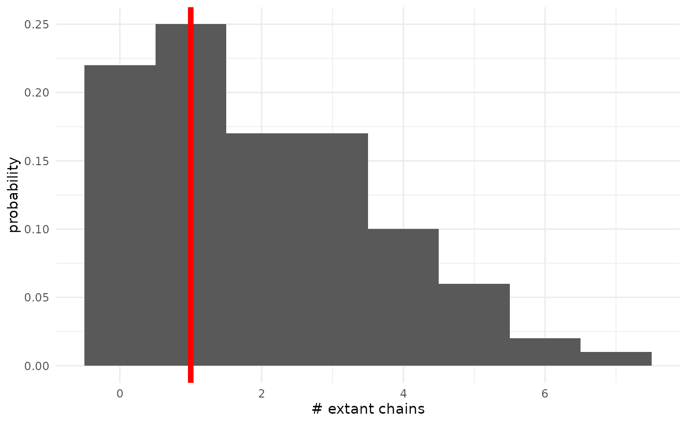
We can see that the posterior predictive distribution favors datasets with 0, 1, or 2 extant chains, and that there is significant posterior mass near the observed value of 1. This is good, and indicates the model is fitting well. We can also see that there is a non-trivial amount of mass on seeing many more non-extinct chains. Since we have seen that the posterior distribution on the extinction probability has a long left tail, this is not particularly surprising.
Mean extinct chain size
Another quantity we should expect our model handles well is the mean size of extinct (finite) chains. As there is some small probability of quite large chains, it will be easiest to examine this on the log scale.
pred_mean <- posterior_predictive |>
  group_by(index) |>
  summarize(
    r = mean(r),
    k = mean(k),
    mean_size = mean(chain_size[is.finite(chain_size)])
  )
obs_mean <- mean(pneumonic_plague_inf[is.finite(pneumonic_plague_inf)])

pred_mean |>
  ggplot(aes(x = mean_size)) +
  geom_histogram(bins = 20, aes(y = after_stat(density))) +
  scale_x_continuous(transform = "log") +
  theme_minimal() +
  xlab("Mean extinct chain size") +
  geom_vline(xintercept = obs_mean, col = "red", lwd = 1.5)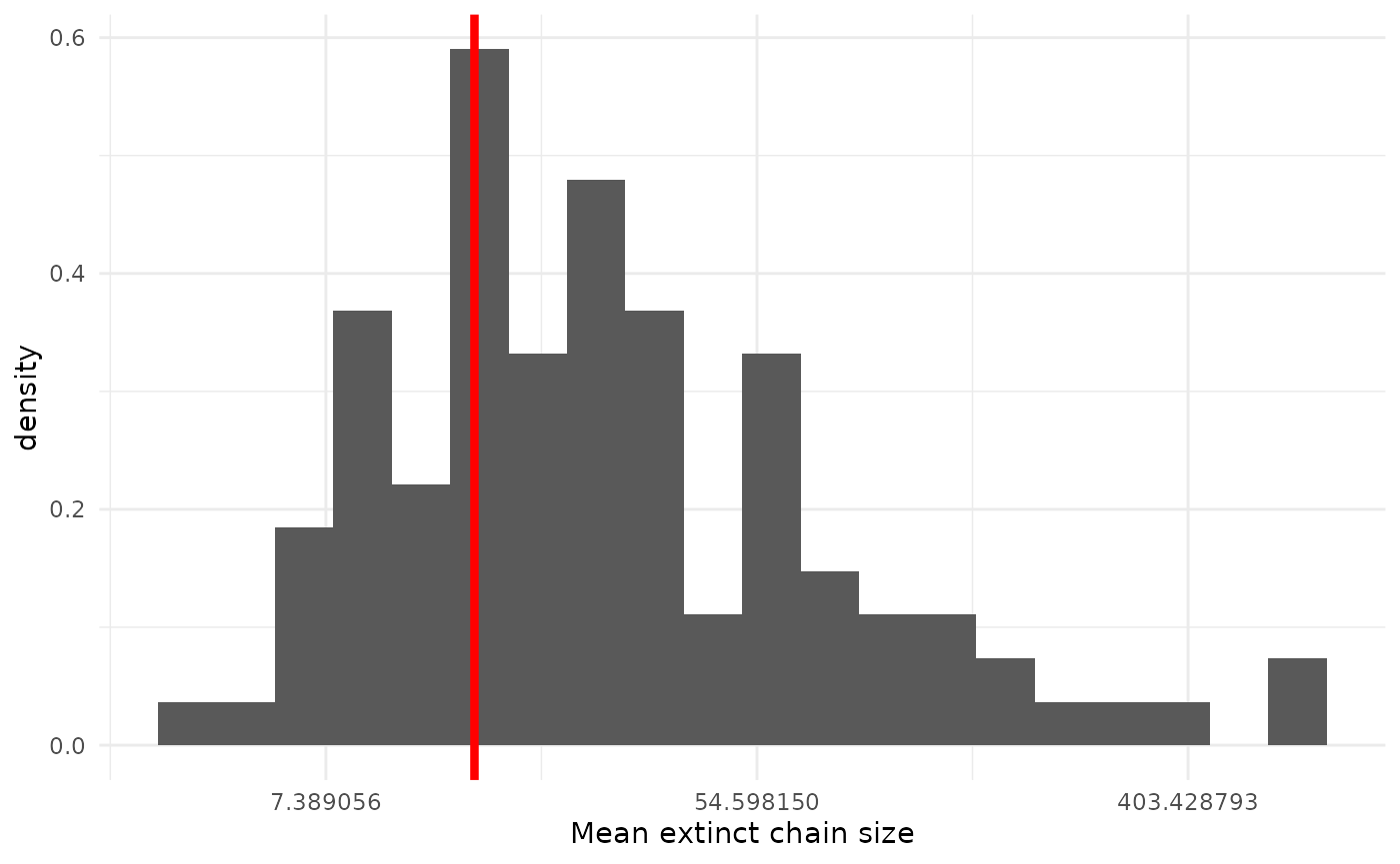
Again, we see our observed value sitting center of mass, which is good. This shouldn’t be particularly surprising, as something would have to go quite pathologically wrong for our model to miss the mean.
Variability of extinct chain sizes
We can also inspect how the variability in chain sizes compares between our real data and our models’ predictive datasets.
pred_sd <- posterior_predictive |>
  group_by(index) |>
  summarize(
    r = mean(r),
    k = mean(k),
    sd_size = sd(chain_size[is.finite(chain_size)])
  )
obs_sd <- sd(pneumonic_plague_inf[is.finite(pneumonic_plague_inf)])

pred_sd |>
  ggplot(aes(x = sd_size)) +
  geom_histogram(bins = 20, aes(y = after_stat(density))) +
  scale_x_continuous(transform = "log") +
  theme_minimal() +
  xlab("SD(extinct chain size)") +
  geom_vline(xintercept = obs_sd, col = "red", lwd = 1.5)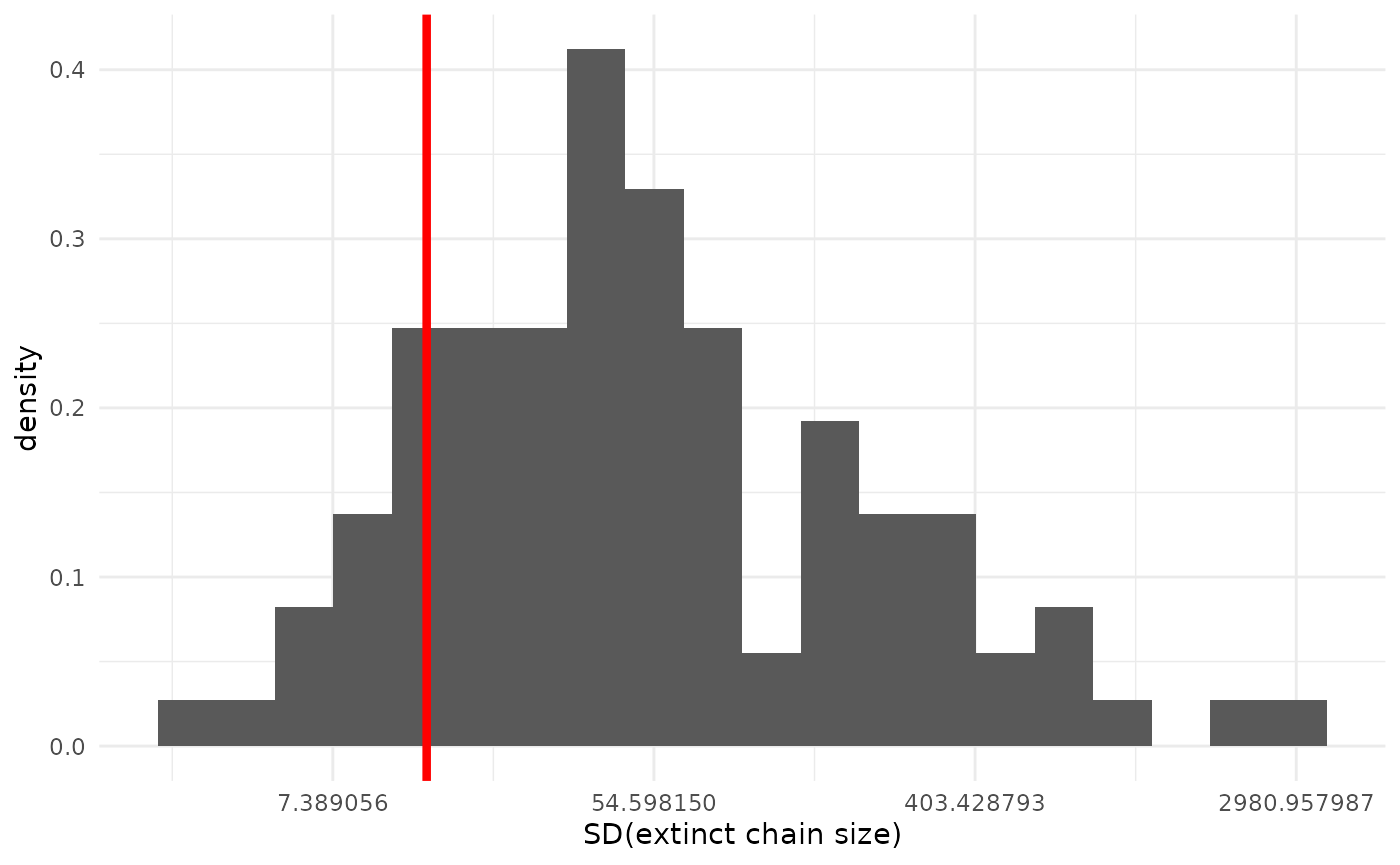
The fit here is not bad, if not as good as for the mean. We can see our model tends to expect somewhat more variability than our observed dataset, but the observed value is still well within the predictive distribution.
Tails
One place we might expect our model to break down more than the first few moments of the distribution is in the tails. The more extreme (by model standards) large chains are where the model is more likely to be a bad description of reality. Here, since we only have 18 finite observations, we will focus on the 83rd percentile of extinct chains (the 4th-largest finite chain size). With larger datasets, we can be more comfortable pushing farther out into the tails.
pred_tail <- posterior_predictive |>
  group_by(index) |>
  summarize(
    r = mean(r),
    k = mean(k),
    fourth_largest = sort(chain_size[is.finite(chain_size)], decreasing = TRUE)[4]
  )
obs_tail <- sort(
  pneumonic_plague_inf[is.finite(pneumonic_plague_inf)],
  decreasing = TRUE
)[4]
pred_tail |>
  ggplot(aes(x = fourth_largest)) +
  geom_histogram(bins = 20, aes(y = after_stat(density))) +
  scale_x_continuous(transform = "log") +
  theme_minimal() +
  xlab("83rd percentile of extinct chain sizes)") +
  geom_vline(xintercept = obs_tail, col = "red", lwd = 1.5)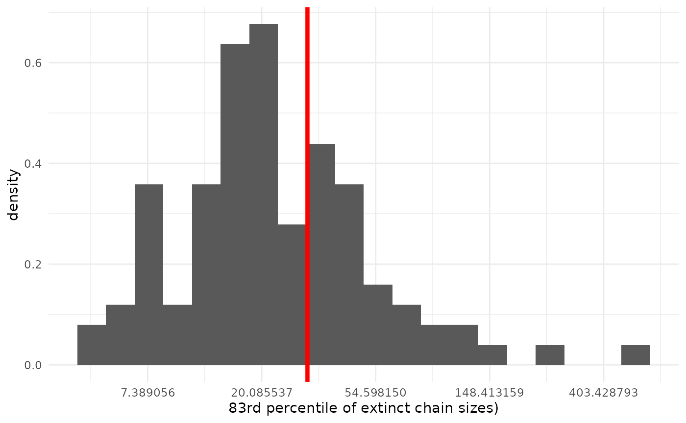
The fit here is again pretty good.
Variability take two
Above, we examined the posterior predictive distribution on chain size standard deviations. But the variability in chain size distribution is related to the mean, so we might wonder if getting either right separately is the most useful question to ask. We can instead look at a function of both, such as the coefficient of variation.
pred_cov <- posterior_predictive |>
  group_by(index) |>
  summarize(
    r = mean(r),
    k = mean(k),
    cov = sd(chain_size[is.finite(chain_size)]) / mean(chain_size[is.finite(chain_size)])
  )
obs_cov <- sd(pneumonic_plague_inf[is.finite(pneumonic_plague_inf)]) /
  mean(pneumonic_plague_inf[is.finite(pneumonic_plague_inf)])

pred_cov |>
  ggplot(aes(x = cov)) +
  geom_histogram(bins = 20, aes(y = after_stat(density))) +
  theme_minimal() +
  xlab("Chain size coefficient of variation") +
  geom_vline(xintercept = obs_cov, col = "red", lwd = 1.5)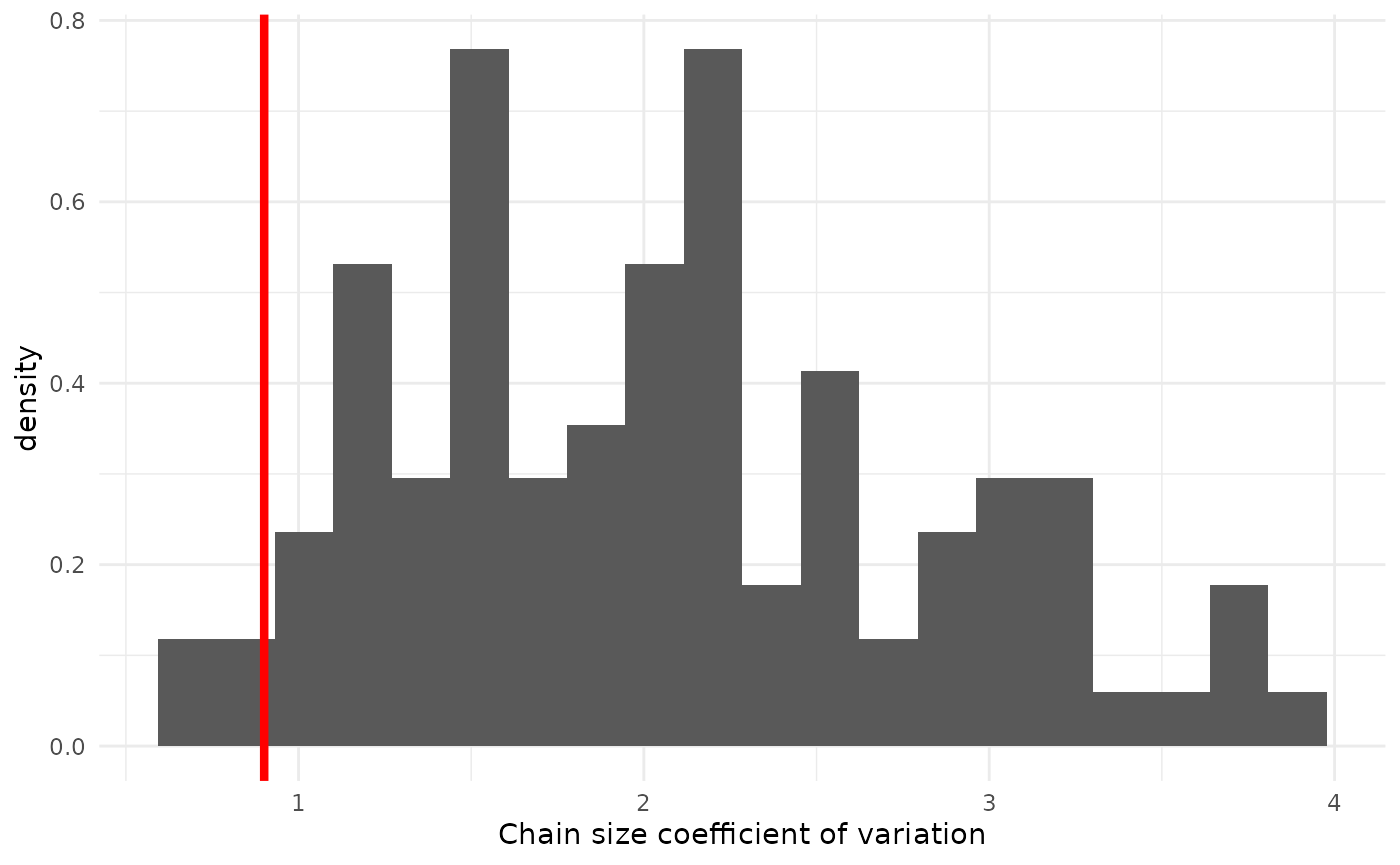
Here we see that our model predicts rather higher coefficients of variation, meaning it expects more concentration relative to the mean. This seems to suggest that the observed chain sizes are less overdispersed than our model predicted, possibly implying that we have somewhat under-estimated . Given everything else we have seen, this does not mean we should immediately throw out our model entirely; all models are wrong, after all. It can, however, provide helpful context knowing how to interpret its predictions. For example, as plays an important role in the tails of the chain-size distribution, we might expect that our tails are a bit too fat and interpret them with caution.
Other distributions on observables
Broadly, the posterior predictive distribution concerns itself with observable quantities, rather than parameters. That is, it’s about things that we could see when we collect data, like mean chain sizes, and not things that we can’t see, like . There may be other such observables that may be of interest that don’t neatly fall into the posterior predictive framework.
What did we not see?
If our data consists only of chains of a certain size, we can use our posterior to ask about how many chains we ignored. Continuing with the pneumonic plague data, where we only have data on chains with at least two cases, we can look at predictions on how many uncounted chains of size 1 the model predicts that we did not include.
# Sample ndraw times from the distribution on # unobserved chains
# We have nobs observed chains counted only if size >= min_obs
# The chains are all iid from an NBBP with given r, k
sample_unseen <- function(r, k, ndraw = 1, nobs = 19, min_obs = 2) {
  p <- 1.0 - sum(
    dnbbp(1:(min_obs - 1), r, k)
  )
  return(rnbinom(ndraw, size = nobs + 1, prob = p))
}
n_unseen <- posterior_predictive |>
  group_by(index) |>
  summarize(
    r = mean(r),
    k = mean(k),
  ) |>
  mutate(
    n_singletons = purrr::map2_int(
      r, k, sample_unseen
    )
  )
n_unseen |>
  ggplot(aes(x = n_singletons)) +
  geom_histogram() +
  theme_minimal() +
  scale_x_continuous(transform = "log") +
  xlab("# singletons unobserved")
## `stat_bin()` using `bins = 30`. Pick better value `binwidth`.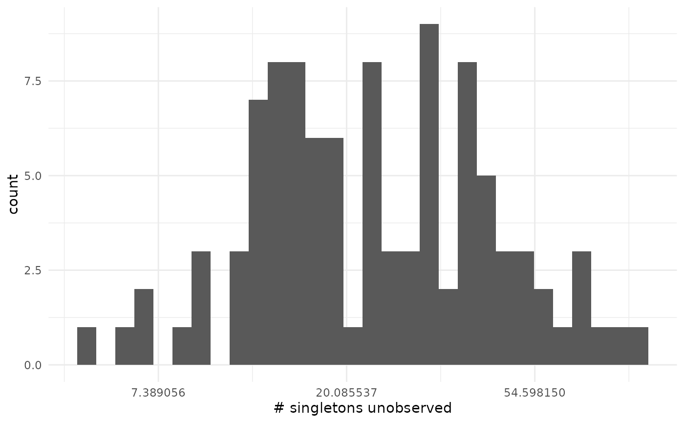
Mathematical details
Technically, this is a separate estimation problem. The true total number of chains, or equivalently the number of unseen size-one chains is an unknown quantity to be estimated. However, we can cast the problem into a shape we can solve based on the posterior for . This is made simpler by the fact that and determine, via the PMF of the NBBP, the probability of observing chains of size 1, which is what allows us to condition in the first place.
Let be the probability of a chain we see in our dataset (in this example, a chain with at least two cases). This is a function of , , and the minimum observed chain size (here 1, so is one minus the probability of a chain of size one). For a given , we can think about the number of chains in our dataset as a sample from a Binomial(, ) distribution with unknown and with . We can then contemplate estimating , or simply the number of unseen chains of size 1, (with chains seen, ). Hunter and Griffiths (1978) provide a posterior distribution . Given an improper uniform prior on the total number of (seen and unseen) chains , they show (Equations 3 + 4) that the distribution is Negative Binomial, with size parameter and probability . Since is a deterministic function of our model parameters (and known minimum chain size cutoff), we can write it as and obtain the marginal distribution
where is our observed chain-size data ().
Model testing with the posterior predictive
The posterior predictive distribution can be used to test models in the frequentist fashion. That is, we can ask if our model is so far off the mark in explaining some feature of our data that we should reject it as inadequate. (Which is to say that inadequate models can be useful, under the right circumstances.) To examine this, let us return to the example of comparing for measles between the U.S. and Canada in the late 1990s. Previously, we saw that the posterior distributions had a small amount of overlap, but that this can be somewhat difficult to interpret. As an alternative, we can examine instead the evidence against a pooled model in which they have the same .
We begin by fitting the pooled model to the combined data.
data(measles_us_97)
data(measles_canada_98)

measles_pooled <- c(measles_us_97, measles_canada_98)

pooled <- fit_nbbp_homogenous_bayes(measles_pooled, iter = 5000, seed = 42)
Now we need some summary statistic whose distribution we can get from this analysis and which will tell us if is different between these two datasets. (By telling us if it’s not the same, which works out to be the same thing here as there are only the two options.) The average chain size is directly linked to , so we will focus on that. In fact, if we assume , per Blumberg and Lloyd-Smith (2014) we can estimate it with the method of moments as 1 - 1 / mean(size). Since we care about a difference in , we will look at a(n absolute) difference in means. The question, then, is “a difference in means between what?”
If the pooled model is correct, then all chains come from the same distribution. We can get the pooled model’s prediction on what differences would look like between these datasets by simulating posterior predictive datasets and assigning the chains randomly into a dataset of size 49 (Canada) and another of size 165 (the U.S.).
nchains <- length(measles_pooled)
npred <- 100

pooled_predictive <- rstan::extract(pooled, pars = c("r_eff", "concentration")) |>
  as.data.frame() |>
  dplyr::rename(r = r_eff, k = concentration) |>
  dplyr::mutate(index = row_number()) |>
  filter(index %in% sample.int(10000, npred)) |>
  mutate(
    chain_size = purrr::map2(
      r, k, function(r, k) {
        rnbbp(nchains, r, k)
      }
    )
  ) |>
  unnest(chain_size)

nus <- length(measles_us_97)
ncan <- length(measles_canada_98)
obs_diff <- abs(mean(measles_canada_98) - mean(measles_us_97))

diff_predictive <- pooled_predictive |>
  group_by(index) |>
  group_map(~ abs(mean(.x$chain_size[1:ncan]) - mean(.x$chain_size[ncan + (1:nus)]))) |>
  unlist() |>
  as.data.frame()
names(diff_predictive) <- "diff_means"

ggplot(diff_predictive, aes(x = diff_means, y = after_stat(density))) +
  geom_histogram(data = diff_predictive) +
  theme_minimal() +
  xlab("Absolute difference in mean chain size") +
  geom_vline(xintercept = obs_diff, col = "red", lwd = 1.5)
## `stat_bin()` using `bins = 30`. Pick better value `binwidth`.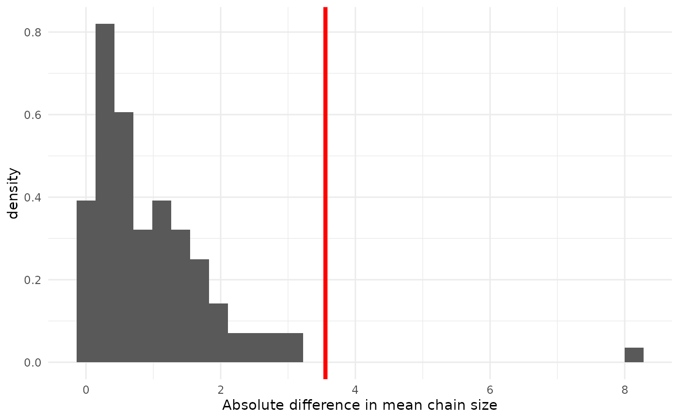
The posterior probability, under the pooled model, of a mean difference as great or greater than observed is 0.05. That the observed difference is unlikely confirms what we suspected from looking at the posteriors of from separate analyses: a pooled model is a poor fit. Note that, in general all one can conclude is that the model is a poor fit. But, since we can separate out the effect on the mean of from , and all effect is from , it is not a huge leap of logic to conclude that the pooled model is wrong because is different in the two groups, rather than because is different (though it might be).