Estimator performance
estimator_performance.Rmd
library(nbbp)
library(dplyr)
library(ggplot2)
library(scales)
library(tidyr)

data(sim_based_testing)
This vignette mostly serves as a series of plots in which one can
examine the quality of point and interval estimates from Bayesian
inference and maximum likelihood using nbbp under default
settings. The data used to do this comes from simulating 100 datasets
each at a grid of
and
values for several dataset sizes (10, 20, and 40 chains observed). For
each simulated dataset, fit_nbbp_homogenous_bayes and
fit_nbbp_homogenous_ml were used to infer parameters,
recording point estimates (posterior median, maximum likelihood) and 95%
uncertainty (credible, confidence) intervals were recorded. This is
available as the package data sim_based_testing.
Plotting functions are provided to compare estimator performance for both point and interval estimates, but for clarity the code is folded by default.
Point estimation performance
point_est_labeler <- as_labeller(c(
  "bayes" = "Posterior median",
  "maxlik" = "Maximum likelihood"
))

plot_point_ests <- function(param, ylim) {
  truth <- ifelse(param == "r", "r_true", "k_true")
  estimated <- ifelse(param == "r", "r_point", "k_point")
  titlename <- ifelse(param == "r", "Estimation of R", "Estimation of k")
  sim_based_testing$factor_truth <- factor(
    round(sim_based_testing[[truth]], 2),
    levels = round(sort(unique(sim_based_testing[[truth]])), 2)
  )
  sim_based_testing$estimator <- factor(
    sim_based_testing[["estimator"]] |> point_est_labeler() |> unlist(),
    levels = c("Posterior median", "Maximum likelihood")
  )
  boxes <- ggplot(data = sim_based_testing, aes(
    x = .data[["factor_truth"]],
    y = .data[[estimated]],
    fill = .data[["estimator"]]
  )) +
    geom_boxplot(outliers = FALSE, alpha = 0.5) +
    theme_minimal() +
    xlab("True value") +
    ylab("Estimated value") +
    ggtitle(titlename)

  true_vals <- sort(unique(sim_based_testing[[truth]]))
  for (i in seq_along(true_vals)) {
    segment <- local({
      i <- i
      geom_segment(
        aes(x = i - 0.5, xend = i + 0.5, y = true_vals[i]),
        col = "red",
        lty = 2
      )
    })
    boxes <- boxes + segment
  }

  return(boxes)
}

plot_point_ests_covar <- function(param, covar) {
  truth <- ifelse(param == "r", "r_true", "k_true")
  estimated <- ifelse(param == "r", "r_point", "k_point")
  titlename <- ifelse(param == "r", "Estimation of R", "Estimation of k")
  sim_based_testing$factor_truth <- factor(
    round(sim_based_testing[[truth]], 2),
    levels = round(sort(unique(sim_based_testing[[truth]])), 2)
  )
  sim_based_testing$factor_covar <- factor(
    sim_based_testing[[covar]],
    levels = sort(unique(sim_based_testing[[covar]]))
  )
  boxes <- ggplot(data = sim_based_testing, aes(
    x = .data[["factor_truth"]],
    y = .data[[estimated]],
    fill = .data[["factor_covar"]]
  )) +
    geom_boxplot(outliers = FALSE, alpha = 0.5) +
    scale_fill_viridis_d("viridis", name = covar) +
    facet_wrap(vars(get("estimator")), labeller = point_est_labeler) +
    theme_minimal() +
    xlab("True value") +
    ylab("Estimated value") +
    ggtitle(titlename)

  true_vals <- sort(unique(sim_based_testing[[truth]]))
  for (i in seq_along(true_vals)) {
    segment <- local({
      i <- i
      geom_segment(
        aes(x = i - 0.5, xend = i + 0.5, y = true_vals[i]),
        col = "red",
        lty = 2
      )
    })
    boxes <- boxes + segment
  }

  return(boxes)
}First, let us examine estimation of aggregated across all simulated values of and all dataset sizes We can see that the two approaches have some similar behaviors, in that they both tend to underestimate when the true and neither does amazingly well when the true (Bayesian estimates are somewhat biased, maximum likelihood estimates very high-variance). In general, unless is particularly large or small, it would seem that the posterior median is a better estimator than the maximum likelihood value, and as we will see later it handles better the small sample size case.
plot_point_ests("r")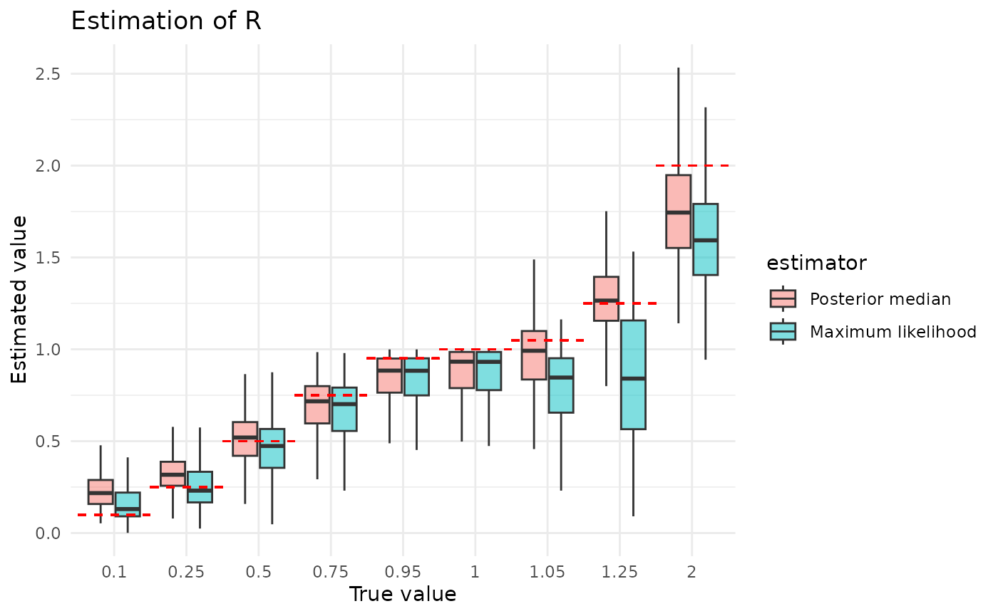
In the plots below, we examine how estimation of is impacted by the size of the dataset and the (true) value of . Three things are evident from these plots. 1. Estimation gets better as datasets get larger. 2. Estimation gets better as the (true) gets larger. 3. The posterior median is less sensitive to (true) than maximum likelihood. While the first of these makes immediate sense, the other two require some explanation.
There are two ways we can intuitively understand the second observation. What we might term the estimator interpretation starts with the facts that is a mean and controls the variance (recall that larger means smaller variance). An estimator’s variability in estimating a mean is a function of two things, it decreases with increasing sample size and increases with increasing variance of the underlying distribution. Think of, for example, the formula for the standard error of the mean. This doesn’t explain why we underestimate, though, just why we mis-estimate. We can explain that with what we might term the correlation interpretation. This starts with the fact that both small and small produce higher extinction probabilities. Thus, we might mistake a smaller for a smaller . Providing some credence to this possibility, ws we will see in a later section, is often severely over-estimated.
The relative lack of posterior median sensitivity to the true value of is definitely an effect of the prior. In particular, as we see below, maximum likelihood has serious difficulties estimating , likely because the likelihood surface is uninformative. In these regimes, the prior will have a notable impact on the posterior, and prior on has a lot of mass on in the regions used in simulation. This is a strength of the Bayesian approach: it lets us inform how the posterior should look when the likelihood provides little information.
plot_point_ests_covar("r", "n_chains")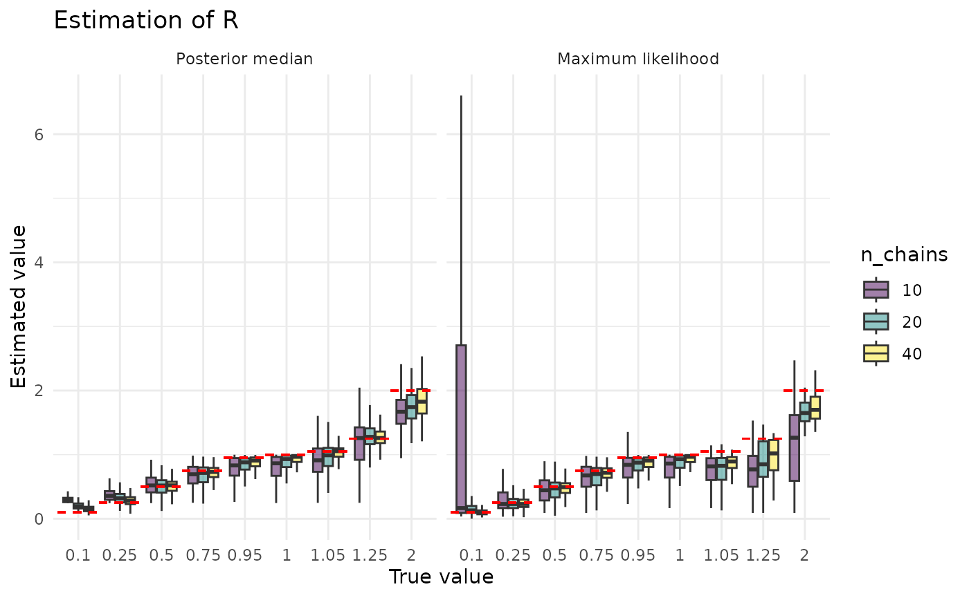
plot_point_ests_covar("r", "k_true")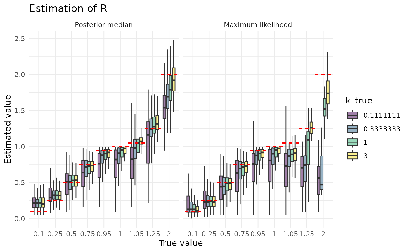
The posterior median is clearly a much better estimator of than the maximum likelihood value. It is also less sensitive to the size of the dataset and to the true value of . The reasons for this, and for maximum likelihood’s greater sensitivity, are the inverses of the reasons described above for why estimation of looks the way it does.
plot_point_ests("k") + coord_cartesian(ylim = c(0, 10))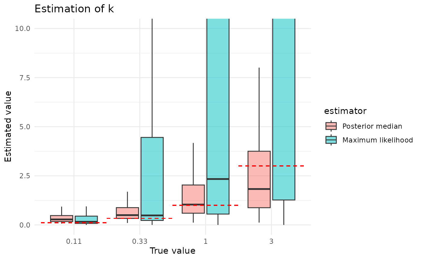
plot_point_ests_covar("k", "n_chains") + coord_cartesian(ylim = c(0, 10))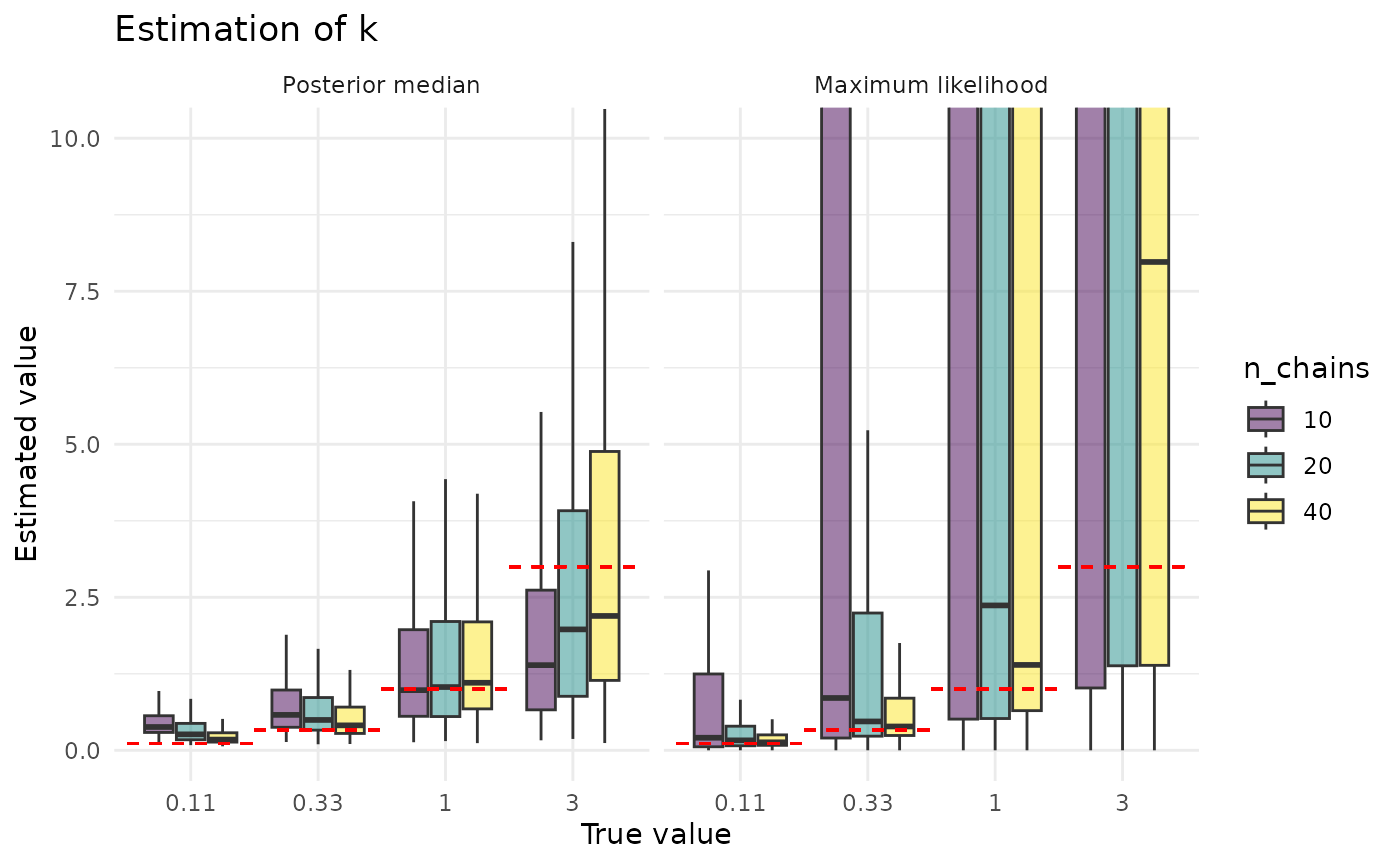
plot_point_ests_covar("k", "r_true") + coord_cartesian(ylim = c(0, 10))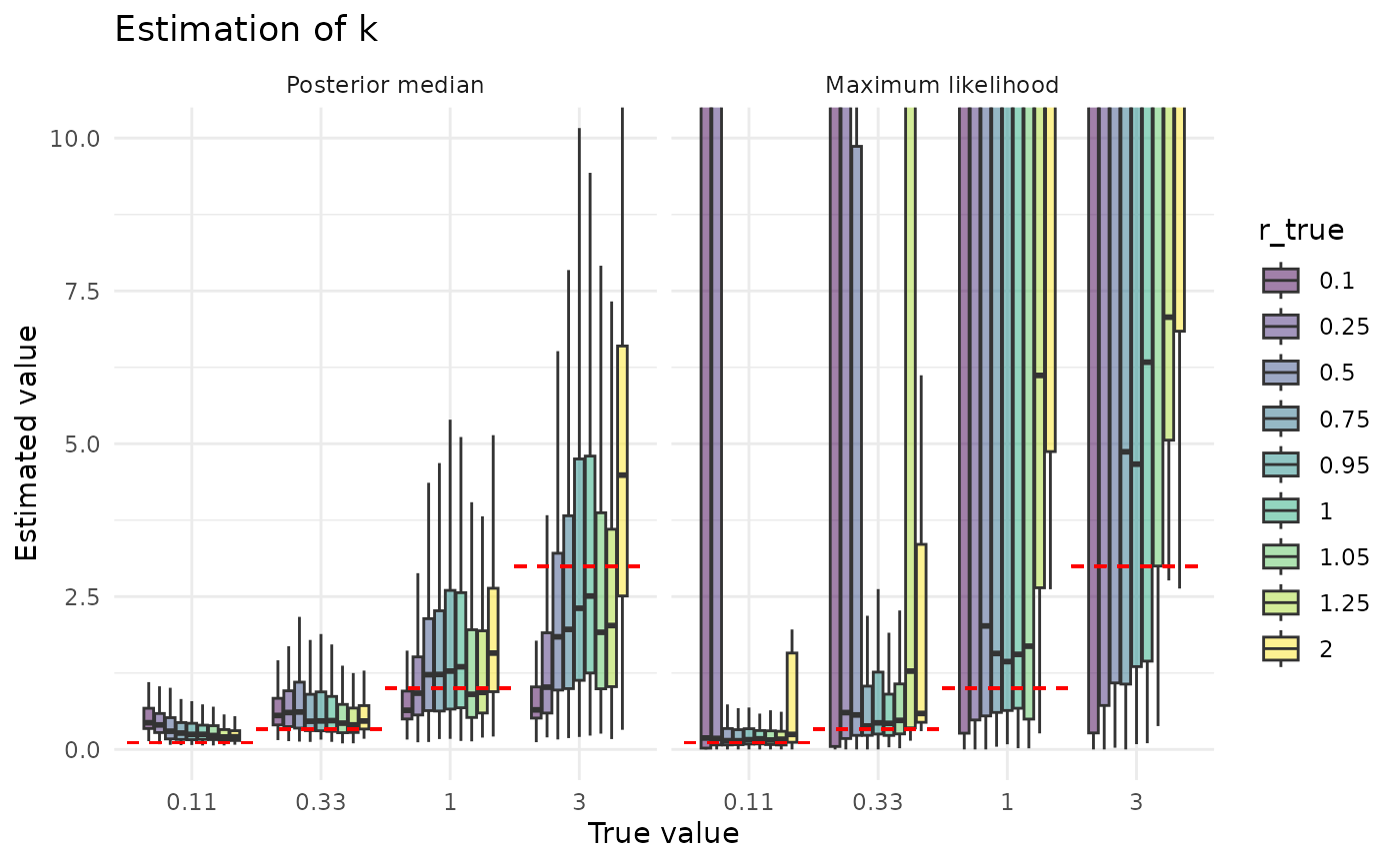
Coverage of 95% CIs
In the following plots, the points display the observed coverage. That is, if the true value is covered in 50 out of 100 replicate analyses, the point shows this as 0.5. However, we are estimating coverage, and if we simulated 100 more datasets, we might see 47 covered, or 55. Thus, we also plot error bars displaying a measure of this sampling-based uncertainty about the estimated coverage. (In particular, we plot the 95% Jeffreys CI).
Note that “good” performance can be counterintuitive here. The simulations record the 95% CIs for both approaches, which means that the ideal coverage is 95%.1 That is, a “good” 95% CI will be wrong 5% of the time. (Otherwise it isn’t a 95% CI, it’s something else.) All things being equal, though, we’d generally rather it covered a bit too much rather than not quite enough. That is, 96% coverage would be preferable to 94%, but 94% is still better than 100%.
As discussed in the “Implementation details” vignette, the confidence intervals provided with maximum likelihood estimates use a hybrid approach, determining on a per-analysis basis whether to use parametric bootstrapping or likelihod profiling. Coverage of confidence intervals varies strongly by the method used, and these results apply only to this strategy.
coverage_labeler <- as_labeller(c(
  "bayes" = "Credible interval",
  "maxlik" = "Confidence interval"
))

plot_coverage <- function(param, ci_alpha = 0.05) {
  truth <- ifelse(param == "r", "r_true", "k_true")
  low <- ifelse(param == "r", "r_low", "k_low")
  high <- ifelse(param == "r", "r_high", "k_high")
  estimated <- ifelse(param == "r", "r_point", "k_point")
  titlename <- ifelse(param == "r", "Coverage of R", "Coverage of k")
  sim_based_testing$factor_truth <- factor(
    round(sim_based_testing[[truth]], 2),
    levels = round(sort(unique(sim_based_testing[[truth]])), 2)
  )
  sim_based_testing$estimator <- factor(
    sim_based_testing[["estimator"]] |> coverage_labeler() |> unlist(),
    levels = c("Credible interval", "Confidence interval")
  )
  sim_based_testing |>
    mutate(covered = r_true > r_low & r_true < r_high) |>
    group_by_at(c("estimator", "factor_truth")) |>
    summarize(
      coverage = mean(get("covered"), na.rm = TRUE),
      sample_size = sum(!(is.na(get("covered"))))
    ) |>
    ungroup() |>
    mutate(
      q_lo = case_when(
        coverage == 0.0 ~ 0.0,
        coverage == 1.0 ~ !!ci_alpha,
        .default = !!(ci_alpha / 2)
      ),
      q_hi = case_when(
        coverage == 0.0 ~ 1 - !!ci_alpha,
        coverage == 1.0 ~ 1.0,
        .default = 1 - !!(ci_alpha / 2)
      )
    ) |>
    mutate(
      coverage_lo = qbeta(q_lo, coverage * sample_size + 0.5, (1 - coverage) * sample_size + 0.5),
      coverage_hi = qbeta(q_hi, coverage * sample_size + 0.5, (1 - coverage) * sample_size + 0.5)
    ) |>
    ggplot(aes(
      x = .data[["factor_truth"]],
      y = .data[["coverage"]],
      col = .data[["estimator"]]
    )) +
    geom_pointrange(
      aes(ymin = coverage_lo, ymax = coverage_hi),
      fatten = 2,
      position = position_dodge2(width = 0.75)
    ) +
    theme_minimal() +
    ylim(c(0, 1)) +
    geom_hline(yintercept = 0.95, lty = 2, col = "red") +
    xlab("True value") +
    ylab("Coverage") +
    ggtitle(titlename)
}

plot_coverage_covar <- function(param, covar, ci_alpha = 0.05) {
  truth <- ifelse(param == "r", "r_true", "k_true")
  low <- ifelse(param == "r", "r_low", "k_low")
  high <- ifelse(param == "r", "r_high", "k_high")
  estimated <- ifelse(param == "r", "r_point", "k_point")
  titlename <- ifelse(param == "r", "Coverage of R", "Coverage of k")
  sim_based_testing$factor_truth <- factor(
    round(sim_based_testing[[truth]], 2),
    levels = round(sort(unique(sim_based_testing[[truth]])), 2)
  )
  sim_based_testing$factor_covar <- factor(
    sim_based_testing[[covar]],
    levels = sort(unique(sim_based_testing[[covar]]))
  )
  sim_based_testing |>
    mutate(covered = r_true > r_low & r_true < r_high) |>
    group_by_at(c("estimator", covar, "factor_covar", "factor_truth")) |>
    summarize(
      coverage = mean(get("covered"), na.rm = TRUE),
      sample_size = sum(!(is.na(get("covered"))))
    ) |>
    ungroup() |>
    mutate(
      q_lo = case_when(
        coverage == 0.0 ~ 0.0,
        coverage == 1.0 ~ !!ci_alpha,
        .default = !!(ci_alpha / 2)
      ),
      q_hi = case_when(
        coverage == 0.0 ~ 1 - !!ci_alpha,
        coverage == 1.0 ~ 1.0,
        .default = 1 - !!(ci_alpha / 2)
      )
    ) |>
    mutate(
      coverage_lo = qbeta(q_lo, coverage * sample_size + 0.5, (1 - coverage) * sample_size + 0.5),
      coverage_hi = qbeta(q_hi, coverage * sample_size + 0.5, (1 - coverage) * sample_size + 0.5)
    ) |>
    ggplot(aes(
      x = .data[["factor_truth"]],
      y = .data[["coverage"]],
      col = .data[["factor_covar"]]
    )) +
    scale_color_viridis_d("viridis", name = covar) +
    geom_pointrange(
      aes(ymin = coverage_lo, ymax = coverage_hi),
      fatten = 2,
      position = position_dodge2(width = 0.75)
    ) +
    theme_minimal() +
    ylim(c(0, 1)) +
    geom_hline(yintercept = 0.95, lty = 2, col = "red") +
    facet_wrap(vars(get("estimator")), labeller = coverage_labeler) +
    xlab("True value") +
    ylab("Coverage") +
    ggtitle(titlename)
}Coverage of by both credible and confidence intervals is generally good, and rarely dips below 90% on average (averaged across the simulation grid).
plot_coverage("r")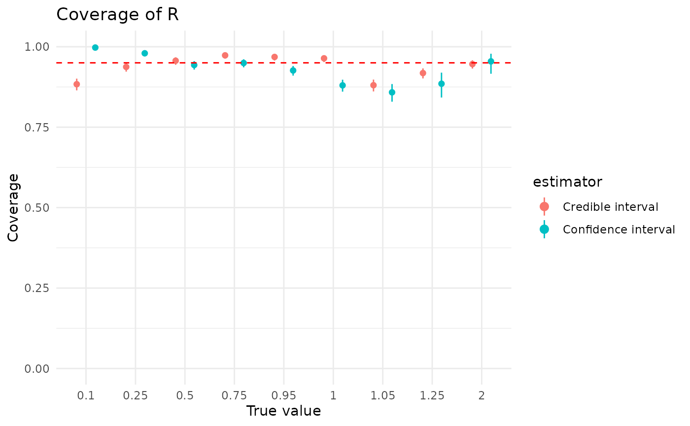
For both approaches, more data is helpful, though it has a much bigger effect on confidence intervals. The dip in confidence interval coverage above 1 disappears by the time there are at least 40 observations in the dataset. Credible intervals show less sensitivity to the (true) value of than confidence intervals
plot_coverage_covar("r", "n_chains")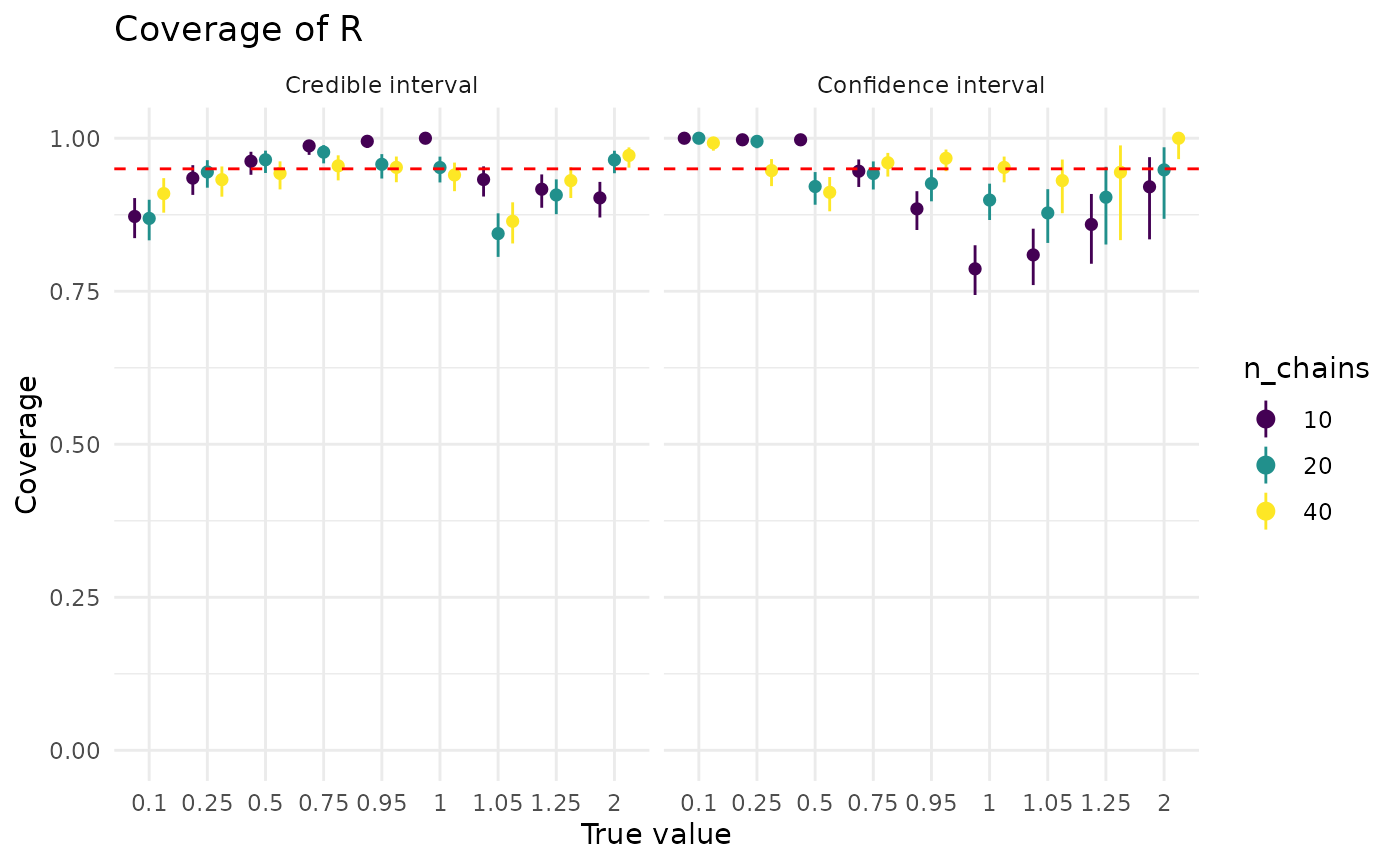
plot_coverage_covar("r", "k_true")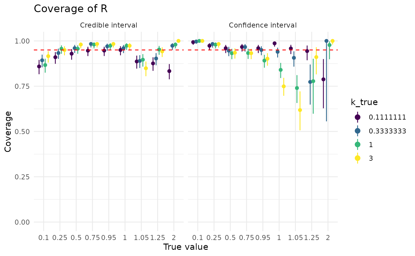
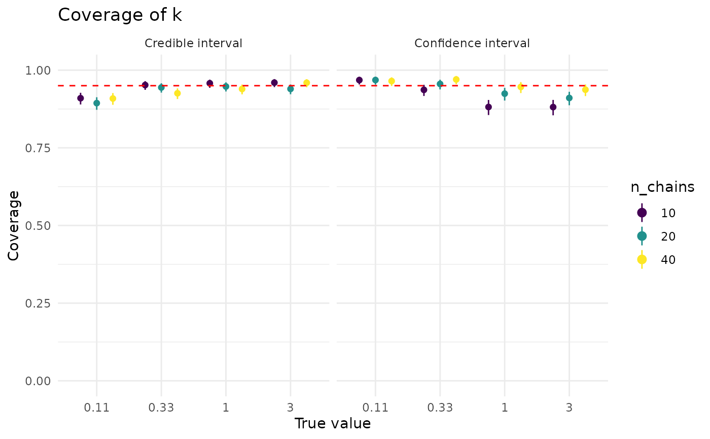
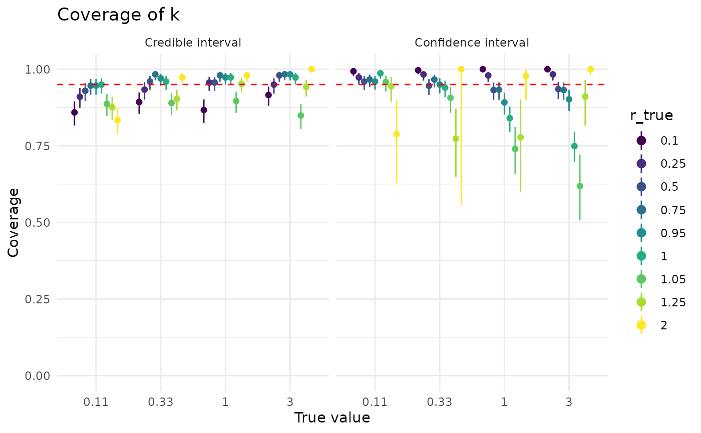
Coverage of is also generally good for confidence and credible intervals. Both confidence and credible intervals for perform better when is closer to 1, though credible intervals for are less sensitive to than confidence intervals. The effect of larger dataset sizes is somewhat more subdued than for , but more data does improve coverage.
plot_coverage("k") + coord_cartesian(ylim = c(0.7, 1))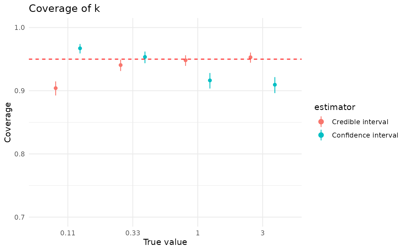
CI widths
Coverage is not the only thing we care about with our CIs. We also care about how narrow or wide the intervals are: all else equal, we’d prefer a narrower interval.
Here, all else is not always equal exactly equal, though coverage is often qualitatively similar. Credible intervals are often much, much narrower than confidence intervals. For , the width of credible intervals is often 50% or less of the width of confidence intervals. For , the width of credible intervals can be less than 1% of the width of confidence intervals. This is not an absolute for either or ; sometimes credible intervals are wider, though credible are basically never as much wider than confidence intervals as confidence intervals are than credible intervals.
Below are plots showing the ratio of the widths of credible to confidence intervals for and , grouped by the true (simulating) values. The horizontal line is at 1, highlighting the divide between credible intervals being smaller (ratio below 1) and larger (ratio above 1) than confidence intervals. We suppress in order to see the rest of the values, as at a good proportion of confidence intervals for are essentially infinite.
bayes <- sim_based_testing |>
  mutate(width = r_high - r_low) |>
  filter(estimator == "bayes")

maxlik <- sim_based_testing |>
  mutate(width = r_high - r_low) |>
  filter(estimator == "maxlik")

bayes |>
  filter(r_true < 2) |>
  inner_join(
    maxlik,
    by = c("index", "n_chains", "r_true", "k_true"),
    suffix = c("_bayes", "_maxlik")
  ) |>
  mutate(width_ratio = width_bayes / width_maxlik) |>
  ggplot(aes(x = factor(r_true), y = (width_ratio))) +
  geom_boxplot(outliers = FALSE) +
  geom_hline(yintercept = 1.0, lty = 2, lwd = 1.25, col = "red") +
  scale_y_continuous(trans = "log2") +
  theme_minimal() +
  xlab("True R") +
  ylab("CI width ratio for R")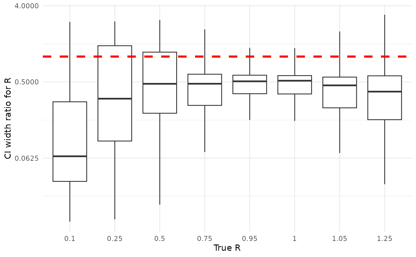
bayes <- sim_based_testing |>
  mutate(width = k_high - k_low) |>
  filter(estimator == "bayes")

maxlik <- sim_based_testing |>
  mutate(width = k_high - k_low) |>
  filter(estimator == "maxlik")

bayes |>
  inner_join(
    maxlik,
    by = c("index", "n_chains", "r_true", "k_true"),
    suffix = c("_bayes", "_maxlik")
  ) |>
  mutate(width_ratio = width_bayes / width_maxlik) |>
  ggplot(aes(x = factor(round(k_true, 2)), y = width_ratio)) +
  geom_boxplot(outliers = FALSE) +
  geom_hline(yintercept = 1.0, lty = 2, lwd = 1.25, col = "red") +
  scale_y_continuous(trans = "log10") +
  theme_minimal() +
  xlab("True k") +
  ylab("CI width ratio for k")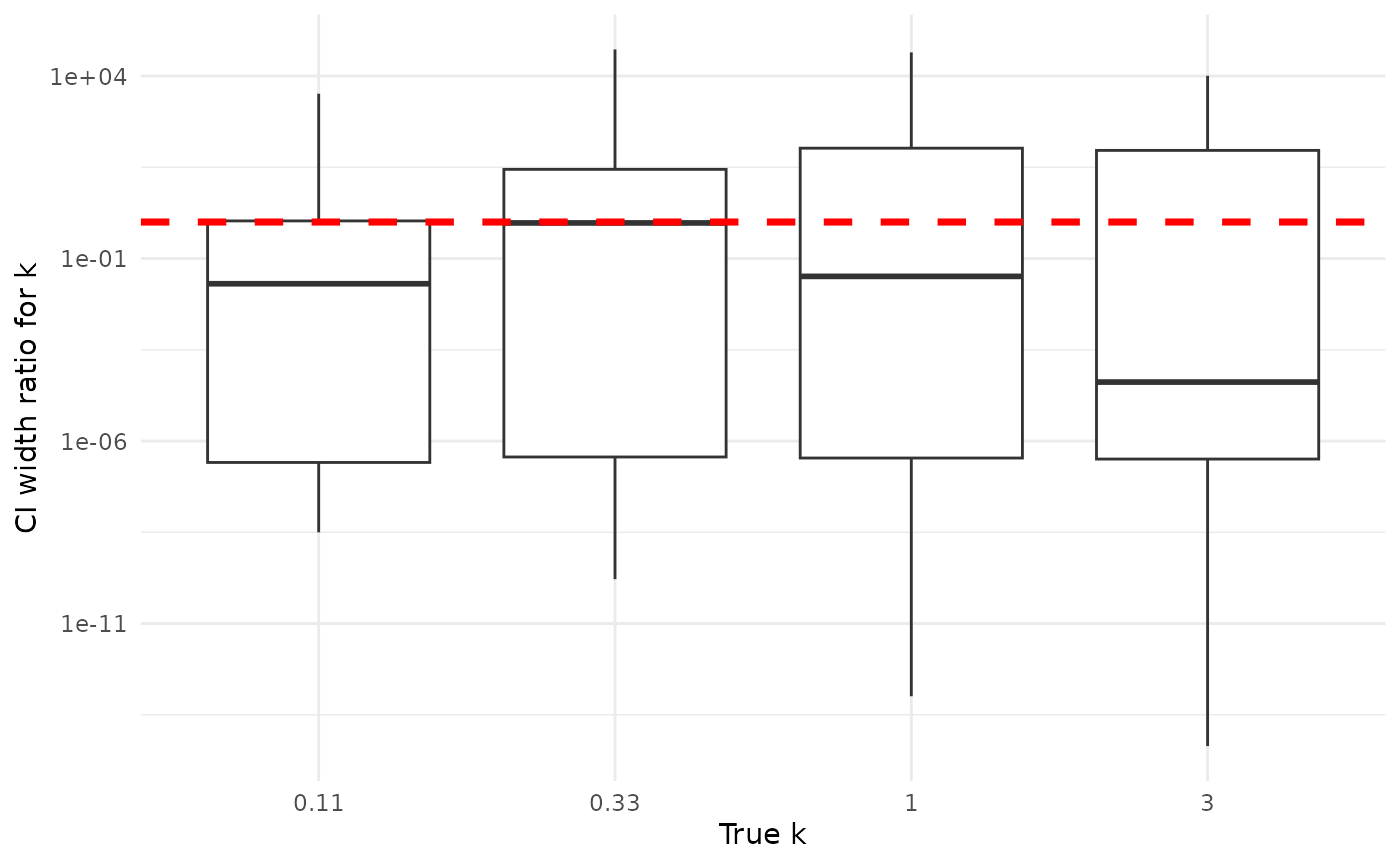
That is, assuming we want good frequentist properties from our Bayesian credible intervals. For the purposes of this comparison, we do. We leave philisophical matters aside as out of scope.↩︎