Observation processes for count data
This tutorial demonstrates how to use the PopulationCounts observation
process to model count data such as hospital admissions, emergency
department visits, or deaths.
Code
import jax.numpy as jnp
import numpy as np
import numpyro
import plotnine as p9
import pandas as pd
import warnings
from plotnine.exceptions import PlotnineWarning

warnings.filterwarnings("ignore", category=PlotnineWarning)

from _tutorial_theme import theme_tutorial
from pyrenew.observation import (
    PopulationCounts,
    NegativeBinomialNoise,
    PoissonNoise,
)
from pyrenew.deterministic import DeterministicVariable, DeterministicPMF
from pyrenew import datasets
Overview
Count observation processes model how latent infections give rise to observed data such as hospital admissions, emergency department visits, confirmed cases, or deaths.
In the renewal modeling framework, observations are generated in two steps:
- A deterministic transformation, where infections are mapped to an expected number of observed events via an ascertainment rate and a delay distribution.
- A stochastic observation model, where observed counts are drawn from a distribution with that predicted value.
Observed data can be aggregated or available as subpopulation-level
counts, which are modeled by the classes PopulationCounts and
SubpopulationCounts, respectively.
Observation equation
The deterministic transformation is given by the observation equation:
where:
- \(I(t-d)\) is the number of incident (new) infections on day \(t-d\)
- \(\alpha\) is the ascertainment rate, the probability that an infection results in an observed event (e.g., hospitalization)
- \(\pi_d\) is the delay distribution from infection to observation, conditional on an infection leading to an observed event
The delay distribution has finite support over lags \(d = 0, \dots, D\) and satisfies
This equation is a discrete convolution: observations at time \(t\) arise from infections that occurred \(d\) days earlier, weighted by the delay distribution.
Stochastic observation model
The observation equation defines the expected number of observed events, but the actual data are stochastic.
Let \(Y(t)\) denote the observed number of events at time \(t\). Observations are modeled as draws from a count distribution with central value (typically but not necessary mean) \(\mu(t)\):
One possible choice is the Poisson distribution, which assumes the variance equals the mean. In practice, epidemiological count data are often overdispersed relative to the Poisson. Negative binomial distributions are a common choice for modeling these overdispersed counts.
This yields a two-layer model:
- A mechanistic layer, where the delay convolution determines the predicted number of observations \(\mu(t)\) from latent infections \(I(t)\).
- A stochastic observation layer, where observed counts \(Y(t)\) vary around \(\mu(t)\) according to a specified distribution.
Note on terminology: In real-world inference, incident infections \(I(t)\) are typically latent (unobserved) and must be inferred from observed data. In this tutorial, we simulate the observation process by specifying infections directly and showing how they produce observed counts through convolution and sampling.
Hospital admissions example
For hospital admissions data, we construct a PopulationCounts
observation process.
The delay is the key mechanism: infections from \(d\) days ago (\(I(t-d)\)) contribute to today’s predicted hospital admissions (\(\mu(t)\)), weighted by the probability \(\pi_d\) that an infection leads to hospitalization after exactly \(d\) days. The convolution sums these contributions across all past days.
Observed hospital admissions are then generated by sampling from a negative binomial distribution:
where \(\phi\) is a concentration parameter controlling variability.
The negative binomial distribution is commonly used because real-world count data are overdispersed, meaning the variance exceeds the mean.
As \(\phi \to \infty\), the negative binomial distribution approaches a Poisson distribution.
In this example, we use fixed parameter values for illustration; in practice, these parameters would be estimated from data using weakly informative priors.
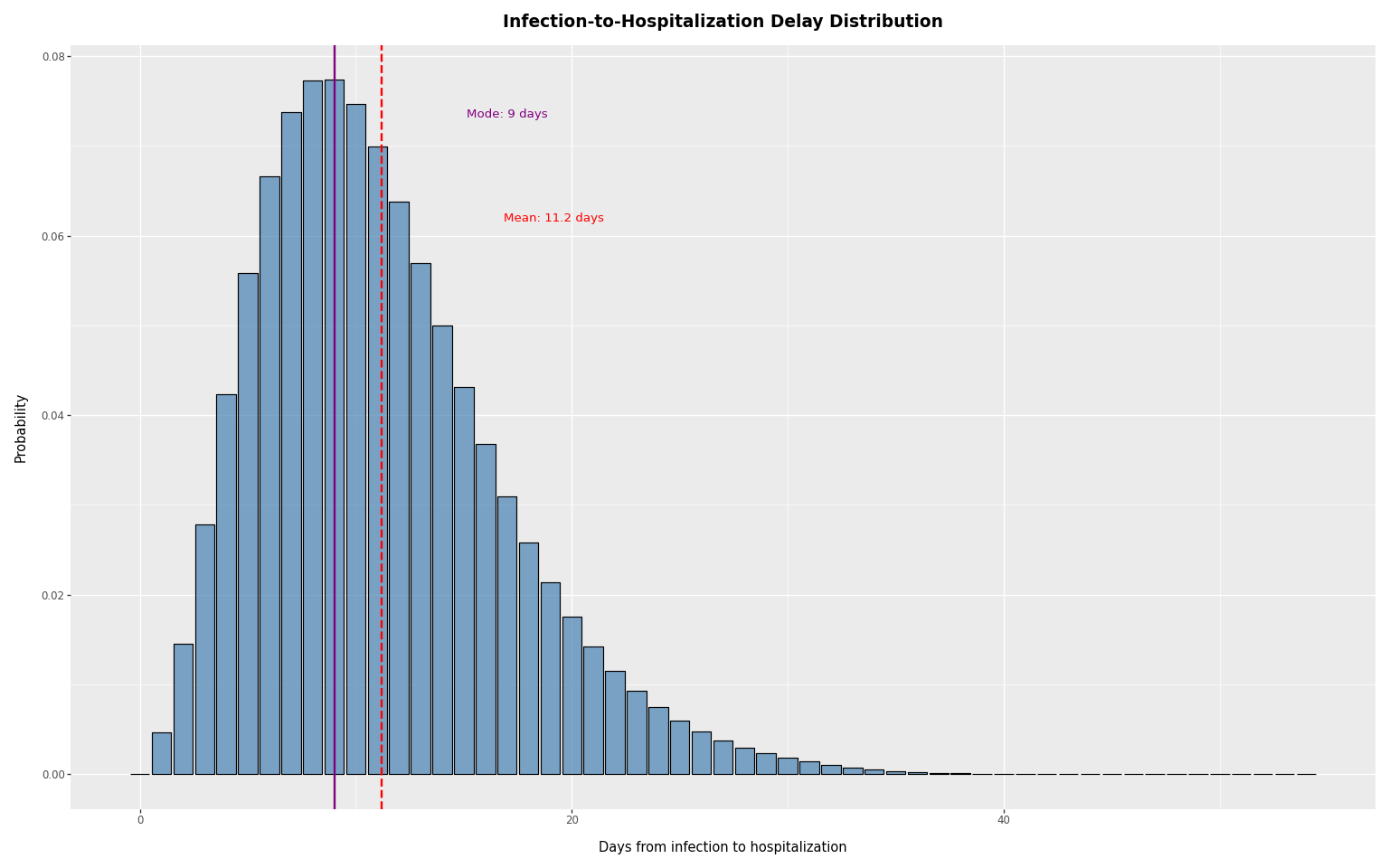
Infection-to-hospitalization delay distribution
The delay distribution specifies the probability that an infected person
is hospitalized \(d\) days after infection, conditional on the infection
leading to a hospitalization. For example, if hosp_delay_pmf[5] = 0.2,
then 20% of infections that result in hospitalization will appear as
hospital admissions 5 days after infection.
We load a delay distribution from PyRenew’s example datasets, compute summary statistics, and plot it. The distribution peaks around day 8-9 post-infection.
Code
inf_hosp_int = datasets.load_example_infection_admission_interval()
hosp_delay_pmf = jnp.array(inf_hosp_int["probability_mass"].to_numpy())
delay_rv = DeterministicPMF("inf_to_hosp_delay", hosp_delay_pmf)

# Summary statistics
days = np.arange(len(hosp_delay_pmf))
mean_delay = float(np.sum(days * hosp_delay_pmf))
mode_delay = int(np.argmax(hosp_delay_pmf))
sd = float(np.sqrt(np.sum(days**2 * hosp_delay_pmf) - mean_delay**2))
print(f"mode delay: {mode_delay},  mean delay: {mean_delay:.1f},  sd: {sd:.1f}")
mode delay: 9, mean delay: 11.2, sd: 5.7
Code
delay_df = pd.DataFrame({"days": days, "probability": np.array(hosp_delay_pmf)})

plot_delay = (
    p9.ggplot(delay_df, p9.aes(x="days", y="probability"))
    + p9.geom_col(fill="steelblue", alpha=0.7, color="black")
    + p9.geom_vline(xintercept=mode_delay, color="purple", linetype="solid", size=1)
    + p9.geom_vline(xintercept=mean_delay, color="red", linetype="dashed", size=1)
    + p9.labs(
        x="Days from infection to hospitalization",
        y="Probability",
        title="Infection-to-Hospitalization Delay Distribution",
    )
    + theme_tutorial
    + p9.annotate(
        "text",
        x=mode_delay + 8,
        y=max(delay_df["probability"]) * 0.95,
        label=f"Mode: {mode_delay} days",
        color="purple",
        size=10,
    )
    + p9.annotate(
        "text",
        x=mean_delay + 8,
        y=max(delay_df["probability"]) * 0.8,
        label=f"Mean: {mean_delay:.1f} days",
        color="red",
        size=10,
    )
)
plot_delay
Creating a PopulationCounts observation process
A PopulationCounts object takes the following arguments:
name: unique, meaningful identifier for this observation process (e.g.,"hospital","deaths")ascertainment_rate_rv: the probability an infection results in an observation (e.g., IHR)delay_distribution_rv: delay distribution from infection to observation (PMF)noise: noise model (PoissonNoise()orNegativeBinomialNoise(concentration_rv))
Observation processes are components in multi-signal models, where each
signal must have a unique name. This name prefixes all numpyro sample
sites (e.g., "hospital" creates sites "hospital_obs" and
"hospital_predicted"), ensuring distinct identifiers in the inference
trace.
For hospital admissions, the ascertainment rate is specifically called the infection-hospitalization rate (IHR). In this example, the percentage of infections which lead to hospitalization is treated as a fixed value, which will allow us to see how different values affect the model. The concentration parameter for the negative binomial noise model is also fixed. In practice, both of these parameters would be given a somewhat informative prior and then inferred.
Code
# Infection-hospitalization ratio (1% of infections lead to hospitalization)
ihr_rv = DeterministicVariable("ihr", 0.01)

# Overdispersion parameter for negative binomial
concentration_rv = DeterministicVariable("concentration", 10.0)

# Create the observation process
hosp_process = PopulationCounts(
    name="hospital",
    ascertainment_rate_rv=ihr_rv,
    delay_distribution_rv=delay_rv,
    noise=NegativeBinomialNoise(concentration_rv),
)
Timeline alignment and lookback period
The observation process convolves infections with a delay distribution, maintaining alignment between input and output: day \(t\) in the output corresponds to day \(t\) in the input.
Hospital admissions depend on infections from prior days. A delay PMF of
length \(L\) covers delays 0 to \(L-1\), requiring \(L-1\) days of prior
infection history. The method lookback_days() returns \(L-1\); the first
valid observation day is at index lookback_days(). Earlier days are
marked invalid.
Code
print(f"Required lookback: {hosp_process.lookback_days()} days")


def first_valid_observation_day(obs_process) -> int:
    """Return the first day index with complete infection history for convolution."""
    return obs_process.lookback_days()
Required lookback: 54 days
Simulating observations from a single-day infection pulse
To demonstrate how a PopulationCounts observation process works, we
examine how infections occurring on a single day result in observed
hospital admissions.
Code
n_days = 100
day_one = first_valid_observation_day(hosp_process)

# Create infections with a spike
infection_spike_day = day_one + 10
infections = jnp.zeros(n_days)
infections = infections.at[infection_spike_day].set(2000)
We plot the infections starting from day_one (the first valid observation day, after the lookback period).
Code
# Plot relative to first valid observation day
n_plot_days = n_days - day_one
rel_spike_day = infection_spike_day - day_one

infections_df = pd.DataFrame(
    {
        "day": np.arange(n_plot_days),
        "count": np.array(infections[day_one:]),
    }
)

max_infection_count = float(jnp.max(infections[day_one:]))

plot_infections = (
    p9.ggplot(infections_df, p9.aes(x="day", y="count"))
    + p9.geom_line(color="darkblue", size=1)
    + p9.geom_point(color="darkblue", size=2)
    + p9.geom_vline(
        xintercept=rel_spike_day,
        color="darkred",
        linetype="dashed",
        alpha=0.5,
    )
    + p9.labs(x="Day", y="Daily Infections", title="Infections (Input)")
    + theme_tutorial
    + p9.annotate(
        "text",
        x=rel_spike_day + 2,
        y=max_infection_count * 0.9,
        label=f"Infection spike (day {rel_spike_day})",
        color="darkred",
        size=10,
    )
)
plot_infections
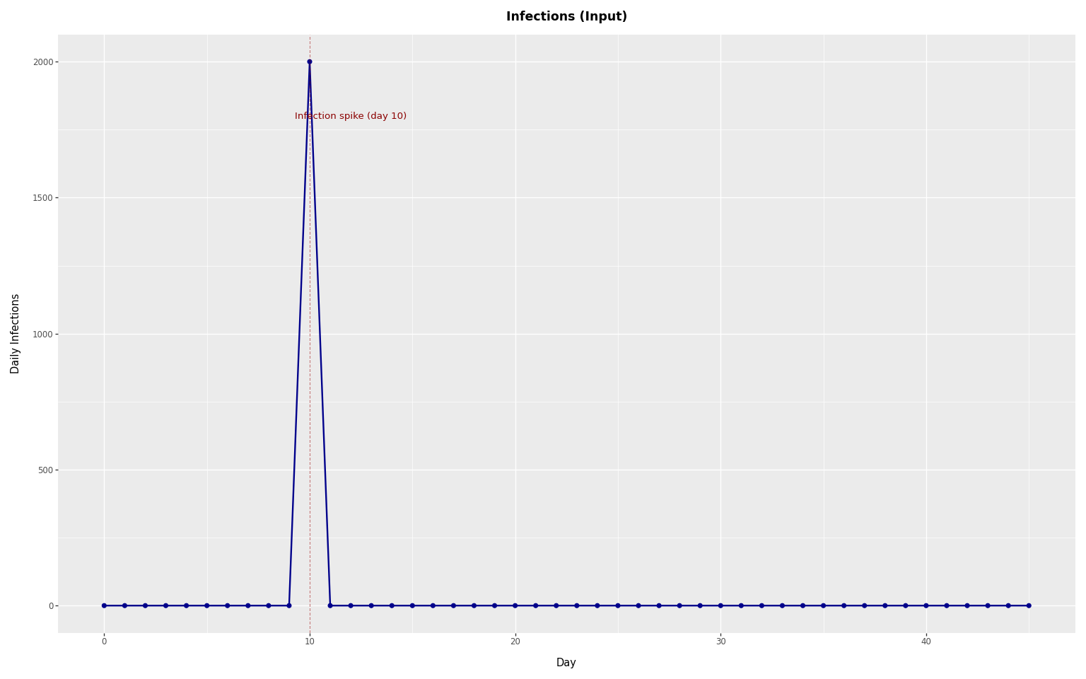
Because all infections occur on a single day, this example shows how a single pulse of infections produces observed events over time through the delay distribution.
Predicted admissions without observation noise.
First, we compute the predicted admissions from the convolution alone, without observation noise. This gives the predicted number of observations \(\mu(t)\).
Code
# Compute predicted admissions (convolution only, no observation noise)
from pyrenew.convolve import compute_delay_ascertained_incidence

# Scale infections by IHR (ascertainment rate)
infections_scaled = infections * float(ihr_rv.sample())

predicted_admissions, offset = compute_delay_ascertained_incidence(
    p_observed_given_incident=1.0,
    latent_incidence=infections_scaled,
    delay_incidence_to_observation_pmf=hosp_delay_pmf,
    pad=True,
)
Note: in the above implementation, the ascertainment rate is applied by scaling infections before convolution. This is equivalent to applying \(\alpha\) after the convolution in the observation equation.
Code
# Relative peak day for plotting
peak_day = rel_spike_day + mode_delay

# Plot predicted admissions (x-axis: day_one = first valid observation day)
predicted_df = pd.DataFrame(
    {
        "day": np.arange(n_plot_days),
        "admissions": np.array(predicted_admissions[day_one:]),
    }
)

max_predicted = float(predicted_df["admissions"].max())
plot_predicted = (
    p9.ggplot(predicted_df, p9.aes(x="day", y="admissions"))
    + p9.geom_line(color="purple", size=1)
    + p9.geom_point(color="purple", size=1.5)
    + p9.geom_vline(
        xintercept=rel_spike_day,
        color="darkred",
        linetype="dashed",
        alpha=0.5,
    )
    + p9.geom_vline(
        xintercept=peak_day,
        color="purple",
        linetype="dashed",
        alpha=0.5,
    )
    + p9.labs(
        x="Day",
        y="Hospital Admissions",
        title="Predicted Hospital Admissions (Deterministic)",
    )
    + theme_tutorial
    + p9.annotate(
        "text",
        x=rel_spike_day,
        y=max_predicted * 1.05,
        label=f"Infection spike\n(day {rel_spike_day})",
        color="darkred",
        size=9,
        ha="center",
    )
    + p9.annotate(
        "text",
        x=peak_day,
        y=max_predicted * 1.05,
        label=f"Peak\n(day {peak_day})",
        color="purple",
        size=9,
        ha="center",
    )
)
plot_predicted
The predicted admissions follow the shape of the delay distribution, shifted by the infection spike day and scaled by the ascertainment rate.
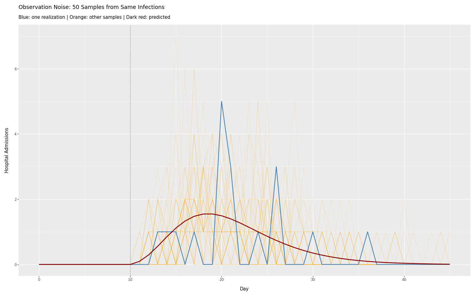
Observation Noise (Negative Binomial)
The negative binomial distribution adds stochastic variation around \(\mu(t)\), corresponding to the stochastic observation layer. Sampling multiple times from the same infections shows the range of possible observations:
Code
# Sample 50 realizations of hospital admissions from the same infection spike
n_samples = 50
samples_list = []

for seed in range(n_samples):
    with numpyro.handlers.seed(rng_seed=seed):
        hosp_sample = hosp_process.sample(infections=infections, obs=None)

    # Slice from day_one to align with valid observation period
    for i, val in enumerate(hosp_sample.observed[day_one:]):
        samples_list.append(
            {
                "day": i,
                "admissions": float(val),
                "sample": seed,
                "type": "sampled",
            }
        )

# Add predicted values
for i, val in enumerate(predicted_admissions[day_one:]):
    samples_list.append(
        {
            "day": i,
            "admissions": float(val),
            "sample": -1,
            "type": "predicted",
        }
    )
Code
samples_df = pd.DataFrame(samples_list)
sampled_df = samples_df[samples_df["type"] == "sampled"]
predicted_noise_df = samples_df[samples_df["type"] == "predicted"]

# Separate one sample to highlight
highlight_sample = 0
other_samples_df = sampled_df[sampled_df["sample"] != highlight_sample]
highlight_df = sampled_df[sampled_df["sample"] == highlight_sample]

plot_50_samples = (
    p9.ggplot()
    + p9.geom_line(
        p9.aes(x="day", y="admissions", group="sample"),
        data=other_samples_df,
        color="orange",
        alpha=0.15,
        size=0.5,
    )
    + p9.geom_line(
        p9.aes(x="day", y="admissions"),
        data=highlight_df,
        color="steelblue",
        size=1,
    )
    + p9.geom_line(
        p9.aes(x="day", y="admissions"),
        data=predicted_noise_df,
        color="darkred",
        size=1.2,
    )
    + p9.geom_vline(
        xintercept=rel_spike_day,
        color="darkblue",
        linetype="dashed",
        alpha=0.5,
    )
    + p9.labs(
        x="Day",
        y="Hospital Admissions",
        title=f"Observation Noise: {n_samples} Samples from Same Infections",
        subtitle="Blue: one realization | Orange: other samples | Dark red: predicted",
    )
    + theme_tutorial
)
plot_50_samples
Code
# Print timeline statistics
print("Timeline Analysis:")
print(
    f"  Infection spike on day {rel_spike_day}: {infections[infection_spike_day]:.0f} people"
)
print(f"  Mode delay from infection to hospitalization: {mode_delay} days")
print(
    f"  Predicted hospitalization peak: day {rel_spike_day + mode_delay} (= {rel_spike_day} + {mode_delay})"
)
Timeline Analysis:
  Infection spike on day 10: 2000 people
  Mode delay from infection to hospitalization: 9 days
  Predicted hospitalization peak: day 19 (= 10 + 9)
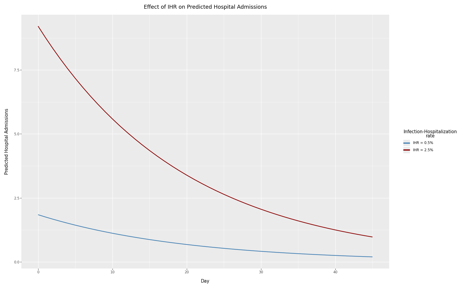
Effect of the ascertainment rate
The ascertainment rate (here, the infection-hospitalization rate or IHR) directly scales the number of predicted hospital admissions. We compare two contrasting IHR values: 0.5% and 2.5%.
Code
# Two contrasting IHR values
ihr_values = [0.005, 0.025]
peak_value = 3000  # Peak infections
infections_decay = peak_value * jnp.exp(-jnp.arange(n_days) / 20.0)

# Compute predicted hospital admissions (no noise) for each IHR
results_list = []
for ihr_val in ihr_values:
    infections_scaled = infections_decay * ihr_val
    predicted_hosp, _ = compute_delay_ascertained_incidence(
        p_observed_given_incident=1.0,
        latent_incidence=infections_scaled,
        delay_incidence_to_observation_pmf=hosp_delay_pmf,
        pad=True,
    )

    for i, admit in enumerate(predicted_hosp[day_one:]):
        results_list.append(
            {
                "day": i,
                "admissions": float(admit),
                "IHR": f"IHR = {ihr_val:.1%}",
            }
        )
Code
results_df = pd.DataFrame(results_list)

plot_ihr = (
    p9.ggplot(results_df, p9.aes(x="day", y="admissions", color="IHR"))
    + p9.geom_line(size=1)
    + p9.scale_color_manual(values=["steelblue", "darkred"])
    + p9.labs(
        x="Day",
        y="Predicted Hospital Admissions",
        title="Effect of IHR on Predicted Hospital Admissions",
        color="Infection-Hospitalization\nrate",
    )
    + theme_tutorial
)
plot_ihr
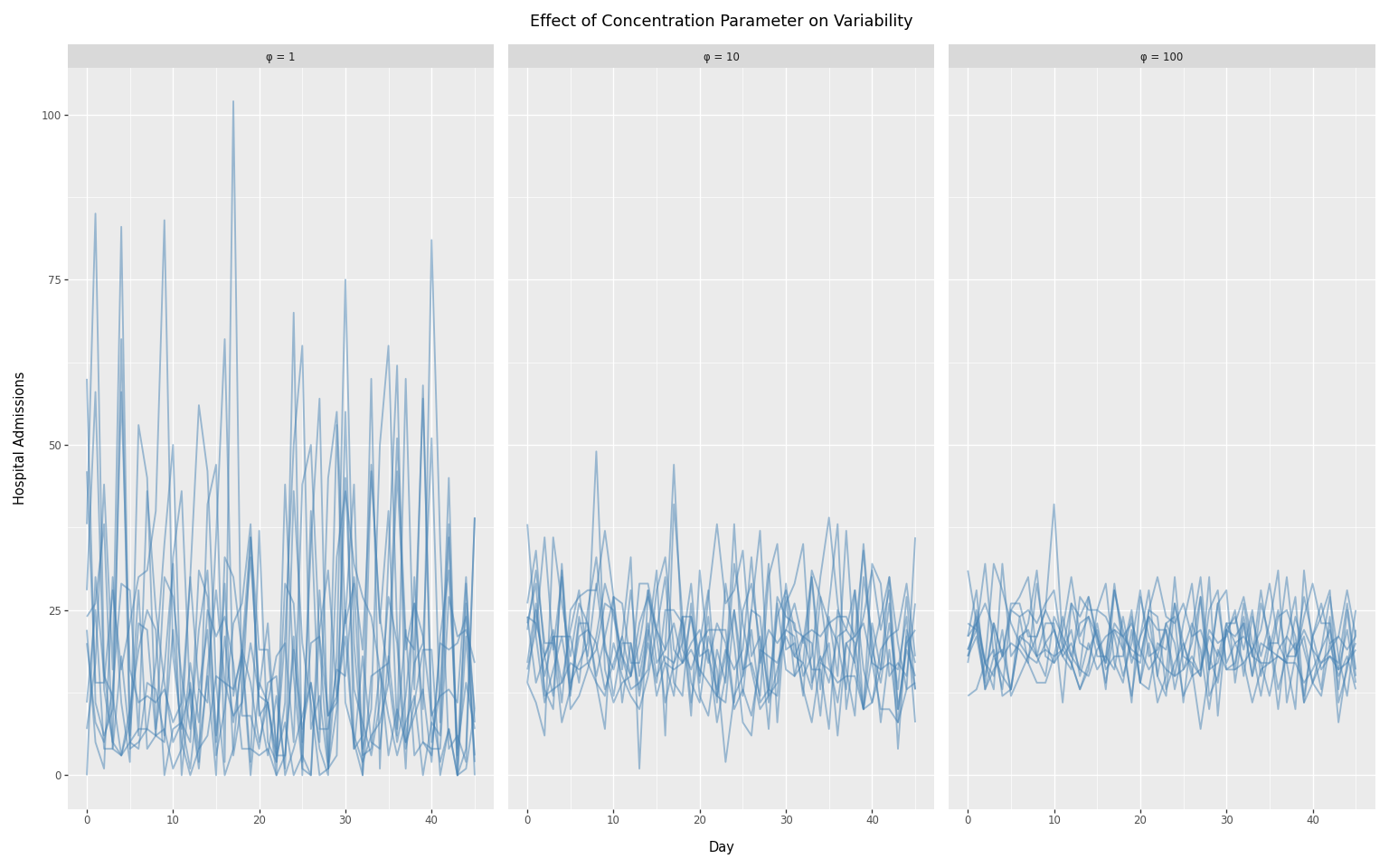
Negative binomial concentration parameter
The concentration parameter \(\phi\) controls overdispersion:
- Higher \(\phi\) → less overdispersion (approaches Poisson)
- Lower \(\phi\) → more overdispersion (noisier data)
We compare three concentration values spanning two orders of magnitude:
- \(\phi\)= 1: high overdispersion (noisy)
- \(\phi\)= 10: moderate overdispersion
- \(\phi\)= 100: nearly Poisson (minimal noise)
We hold daily infections constant over time so that any variation in the observed counts comes entirely from the observation model.
Code
# Use constant infections
peak_value = 2000
infections_constant = peak_value * jnp.ones(n_days)

# Concentration values spanning two orders of magnitude
concentration_values = [1.0, 10.0, 100.0]
n_replicates = 10

# Collect results
conc_results = []
for conc_val in concentration_values:
    conc_rv_temp = DeterministicVariable("conc", conc_val)
    process_temp = PopulationCounts(
        name="hospital",
        ascertainment_rate_rv=ihr_rv,
        delay_distribution_rv=delay_rv,
        noise=NegativeBinomialNoise(conc_rv_temp),
    )

    for seed in range(n_replicates):
        with numpyro.handlers.seed(rng_seed=seed):
            hosp_temp = process_temp.sample(
                infections=infections_constant,
                obs=None,
            )

        # Slice from day_one to align with valid observation period
        for i, admit in enumerate(hosp_temp.observed[day_one:]):
            conc_results.append(
                {
                    "day": i,
                    "admissions": float(admit),
                    "concentration": f"phi = {int(conc_val)}",
                    "replicate": seed,
                }
            )
Code
conc_df = pd.DataFrame(conc_results)

# Convert to ordered categorical
conc_df["concentration"] = pd.Categorical(
    conc_df["concentration"],
    categories=["phi = 1", "phi = 10", "phi = 100"],
    ordered=True,
)

plot_concentration = (
    p9.ggplot(conc_df, p9.aes(x="day", y="admissions", group="replicate"))
    + p9.geom_line(alpha=0.5, size=0.8, color="steelblue")
    + p9.facet_wrap("~ concentration", ncol=3)
    + p9.labs(
        x="Day",
        y="Hospital Admissions",
        title="Effect of Concentration Parameter on Variability",
    )
    + theme_tutorial
)
plot_concentration
Swapping noise models
To use Poisson noise instead of negative binomial, change the noise model:
Code
hosp_process_poisson = PopulationCounts(
    name="hospital",
    ascertainment_rate_rv=ihr_rv,
    delay_distribution_rv=delay_rv,
    noise=PoissonNoise(),
)

with numpyro.handlers.seed(rng_seed=42):
    poisson_result = hosp_process_poisson.sample(
        infections=infections,
        obs=None,
    )

print(
    f"Sampled {len(poisson_result.observed)} days of hospital admissions with Poisson noise"
)
Sampled 100 days of hospital admissions with Poisson noise
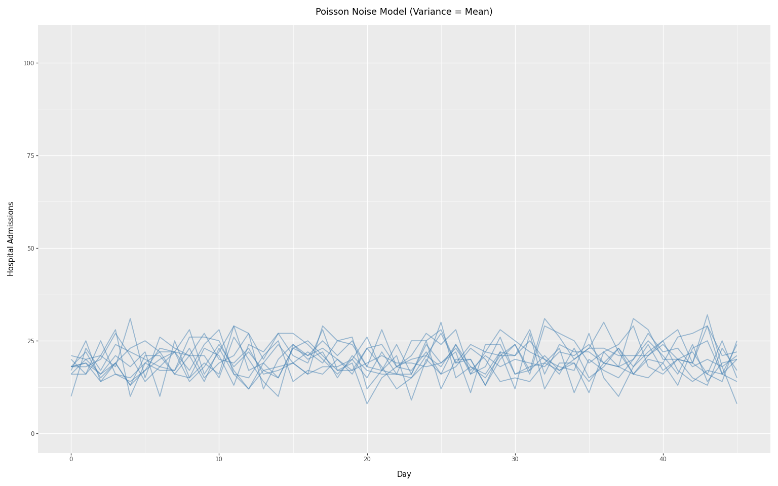
We can visualize the Poisson noise model using the same constant infection scenario as the concentration comparison above. Since Poisson assumes variance equals the mean, it produces less variability than the negative binomial with low concentration values.
To see the reduction in noise, it is necessary to keep the y-axis on the same scale as in the previous plot.
Code
# Sample multiple realizations with Poisson noise
n_replicates_poisson = 10

poisson_results = []
for seed in range(n_replicates_poisson):
    with numpyro.handlers.seed(rng_seed=seed):
        poisson_temp = hosp_process_poisson.sample(
            infections=infections_constant,
            obs=None,
        )

    # Slice from day_one to align with valid observation period
    for i, admit in enumerate(poisson_temp.observed[day_one:]):
        poisson_results.append(
            {
                "day": i,
                "admissions": float(admit),
                "replicate": seed,
            }
        )
poisson_df = pd.DataFrame(poisson_results)

plot_poisson = (
    p9.ggplot(poisson_df, p9.aes(x="day", y="admissions", group="replicate"))
    + p9.geom_line(alpha=0.5, size=0.8, color="steelblue")
    + p9.labs(
        x="Day",
        y="Hospital Admissions",
        title="Poisson Noise Model (Variance = Mean)",
    )
    + theme_tutorial
    + p9.ylim(0, 105)
)
plot_poisson