Fitting a hospital admissions-only model
This document illustrates how a hospital admissions-only model can be fitted using simulated example data.
We begin by loading numpyro and configuring the device count to 2 to
enable running MCMC chains in parallel. By default, XLA (which is used
by JAX for compilation) considers all CPU cores as one device. Depending
on your system’s configuration, we recommend using numpyro’s
set_host_device_count()
function to set the number of devices available for parallel computing.
import numpyro

numpyro.set_host_device_count(2)
/home/runner/work/PyRenew/PyRenew/.venv/lib/python3.14/site-packages/tqdm/auto.py:21: TqdmWarning: IProgress not found. Please update jupyter and ipywidgets. See https://ipywidgets.readthedocs.io/en/stable/user_install.html
  from .autonotebook import tqdm as notebook_tqdm
Model definition
The hospital admissions model is a semi-mechanistic model that describes the number of observed hospital admissions, a positive integer, as a discretely distributed variable whose location is the number of latent hospital admissions $$ h(t) \sim \text{HospDist}\left(H(t)\right), $$ where \(h(t)\) is the observed number of hospital admissions at time \(t\), and \(H(t)\) is the number of latent hospital admissions at time \(t\). For this example \(\text{HospDist}\) is a negative binomial distribution with an inferred concentration \(k\). $$ h(t) \sim \mathrm{NegativeBinomial}\left(\mathrm{mean} = H(t), \mathrm{concentration} = k\right) $$
The number of latent hospital admissions at time \(t\) is a function of the number of latent infections at time \(t\) and the infection to admission rate $$ H(t) = p_\mathrm{hosp}(t) \sum_{\tau = 0}^{T_d} d(\tau) I(t-\tau) $$ where \(d(\tau)\) is the infection to hospital admission interval, \(I(t)\) is the number of latent infections at time \(t\), and \(p_\mathrm{hosp}(t)\) is the infection to admission rate.
The priors on \(p_\mathrm{hosp}(t)\) and \(k\) reflect our knowledge, or lack thereof, of these variables.
Without much information, the prior on \(k\) allows for any amount of overdispersion.
The latent infections are modeled as a renewal process:
The reproduction number \(\mathcal{R}(t)\) is modeled as a random walk in logarithmic space, i.e.:
Data processing
We start by loading the data and inspecting the first five rows.
import polars as pl
from pyrenew import datasets

dat = datasets.load_wastewater()
dat[["date", "site", "daily_hosp_admits"]].head(5)
shape: (5, 3)
| date | site | daily_hosp_admits |
|---|---|---|
| date | i64 | i64 |
| 2023-10-30 | 1 | 6 |
| 2023-10-30 | 1 | 6 |
| 2023-10-30 | 2 | 6 |
| 2023-10-30 | 3 | 6 |
| 2023-10-30 | 4 | 6 |
The data shows one entry per site. In this simulated dataset, all sites have the same number of admissions each day; therefore, we only use the first observation per day, keeping the date and number of admissions. Furthermore, we only use the first 90 days’ worth of data.
# Keeping the first observation of each date, sort by date, first 90 days only
dat = (
    dat.group_by("date")
    .first()
    .select(["date", "daily_hosp_admits"])
    .sort("date")
    .head(90)
)
dat.head(5)
shape: (5, 2)
| date | daily_hosp_admits |
|---|---|
| date | i64 |
| 2023-10-30 | 6 |
| 2023-10-31 | 8 |
| 2023-11-01 | 4 |
| 2023-11-02 | 8 |
| 2023-11-03 | 4 |
Let’s take a look at the daily prevalence of hospital admissions.
import matplotlib.pyplot as plt
import matplotlib.dates as mdates

daily_hosp_admits = dat["daily_hosp_admits"].to_numpy()
dates = dat["date"].to_numpy()
ax = plt.gca()
ax.xaxis.set_major_formatter(mdates.DateFormatter("%Y-%m-%d"))
ax.xaxis.set_major_locator(mdates.DayLocator(interval=7))
ax.set_xlim(dates[0], dates[-1])
plt.setp(ax.get_xticklabels(), rotation=45, ha="right", rotation_mode="anchor")
plt.plot(dates, daily_hosp_admits, "-o")
plt.xlabel("Date")
plt.ylabel("Admissions")
plt.show()
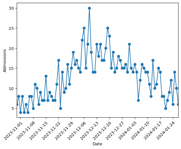
Figure 1: Daily hospital admissions from the simulated data
Building the model
This model uses the following imports from pyrenew, jax, and
numpyro.
from pyrenew import (
    deterministic,
    latent,
    metaclass,
    model,
    observation,
    process,
    randomvariable,
    transformation,
)
from pyrenew.latent import (
    InfectionInitializationProcess,
    InitializeInfectionsExponentialGrowth,
)
import jax.numpy as jnp
import numpyro.distributions as dist
The generation interval and the infection to hospital admission interval
are RandomVariables. Here we load two more datasets which provide
deterministic quantities for these variables.
gen_int = datasets.load_generation_interval()
inf_hosp_int = datasets.load_infection_admission_interval()

# We only need the probability_mass column of each dataset
gen_int_array = gen_int["probability_mass"].to_numpy()
inf_hosp_int_array = inf_hosp_int["probability_mass"].to_numpy()

# Taking a peek at the first 5 elements of each
print("Generation interval\n", gen_int[:5])
print("Hospital admission interval\n", inf_hosp_int_array[:5])
Generation interval
 shape: (5, 2)
┌───────────┬──────────────────┐
│ timepoint ┆ probability_mass │
│ ---       ┆ ---              │
│ i64       ┆ f64              │
╞═══════════╪══════════════════╡
│ 1         ┆ 0.161742         │
│ 2         ┆ 0.320626         │
│ 3         ┆ 0.242283         │
│ 4         ┆ 0.134653         │
│ 5         ┆ 0.068922         │
└───────────┴──────────────────┘
Hospital admission interval
 [0.         0.00469385 0.01452001 0.02786277 0.04236565]
We plot the full distribution curves side-by-side.
fig, axs = plt.subplots(1, 2)

axs[0].plot(gen_int_array)
axs[0].set_title("Generation interval")
axs[1].plot(inf_hosp_int_array)
axs[1].set_title("Infection to hospital admission interval")
fig.supxlabel("Days")
plt.show()
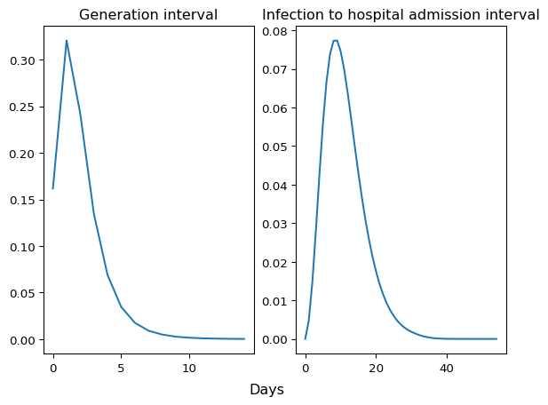
Figure 2: Generation interval and infection to hospital admission interval
With these arrays in hand, we define the necessary components of the model.
-
inf_hosp_intis aDeterministicPMFobject that takes the infection to hospital admission interval as input. -
hosp_rateis aDistributionalVariableobject that takes a numpyro distribution to represent the infection to hospital admission rate -
latent_hospis an instance of theHospitalAdmissionsclass. It is aRandomVariablethat takes two distributions as inputs: the infection to admission interval and the infection to hospital admission rate.
inf_hosp_int = deterministic.DeterministicPMF(
    name="inf_hosp_int", value=inf_hosp_int_array
)

hosp_rate = randomvariable.DistributionalVariable(
    name="IHR", distribution=dist.LogNormal(jnp.log(0.05), jnp.log(1.1))
)

latent_hosp = latent.HospitalAdmissions(
    infection_to_admission_interval_rv=inf_hosp_int,
    infection_hospitalization_ratio_rv=hosp_rate,
)
Next we define infection process IO and generation interval gen_int.
# Infection process
latent_inf = latent.Infections()
n_initialization_points = max(gen_int_array.size, inf_hosp_int_array.size) - 1
I0 = InfectionInitializationProcess(
    "I0_initialization",
    randomvariable.DistributionalVariable(
        name="I0",
        distribution=dist.LogNormal(loc=jnp.log(100), scale=jnp.log(1.75)),
    ),
    InitializeInfectionsExponentialGrowth(
        n_initialization_points,
        deterministic.DeterministicVariable(name="rate", value=0.05),
    ),
)

# Generation interval
gen_int_pmf = deterministic.DeterministicPMF(
    name="gen_int", value=gen_int_array
)
Then we define the \(\mathcal{R}(t)\) random walk process rtproc.
class RtRandomWalk(metaclass.RandomVariable):
    def validate(self):
        pass

    def sample(self, n: int, **kwargs) -> tuple:
        sd_rt = numpyro.sample("Rt_random_walk_sd", dist.HalfNormal(0.025))

        # Random walk step
        step_rv = randomvariable.DistributionalVariable(
            name="rw_step_rv", distribution=dist.Normal(0, sd_rt)
        )

        rt_init_rv = randomvariable.DistributionalVariable(
            name="init_log_rt", distribution=dist.Normal(0, 0.2)
        )

        # Random walk process
        base_rv = process.RandomWalk(
            name="log_rt",
            step_rv=step_rv,
        )

        # Transforming the random walk to the Rt scale
        rt_rv = randomvariable.TransformedVariable(
            name="Rt_rv",
            base_rv=base_rv,
            transforms=transformation.ExpTransform(),
        )
        init_rt = rt_init_rv.sample()

        return rt_rv.sample(n=n, init_vals=init_rt, **kwargs)


rtproc = RtRandomWalk()
The final model component is the observation process obs.
# Put a log-Normal prior on the concentration parameter
# of the negative binomial.
nb_conc_rv = randomvariable.DistributionalVariable(
    "concentration",
    distribution=dist.LogNormal(loc=0.0, scale=jnp.log(10.0)),
)

# The observation process
obs = observation.NegativeBinomialObservation(
    "negbinom_rv",
    concentration_rv=nb_conc_rv,
)
We can now build the model.
hosp_model = model.HospitalAdmissionsModel(
    latent_infections_rv=latent_inf,
    latent_hosp_admissions_rv=latent_hosp,
    I0_rv=I0,
    gen_int_rv=gen_int_pmf,
    Rt_process_rv=rtproc,
    hosp_admission_obs_process_rv=obs,
)
Let’s simulate from the prior predictive distribution to check that the model is working:
import numpy as np

timeframe = 120

with numpyro.handlers.seed(rng_seed=223):
    simulated_data = hosp_model.sample(n_datapoints=timeframe)
import matplotlib.pyplot as plt

fig, axs = plt.subplots(1, 2)

# Rt plot
axs[0].plot(simulated_data.Rt)
axs[0].set_ylabel("Simulated Rt")

# Admissions plot
axs[1].plot(simulated_data.observed_hosp_admissions, "-o")
axs[1].set_ylabel("Simulated Admissions")

fig.suptitle("Basic renewal model")
fig.supxlabel("Time")
plt.tight_layout()
plt.show()
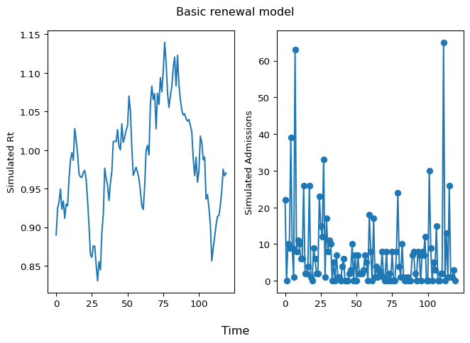
Figure 3: Simulated Rt and Admissions
Fitting the model
We now fit the model, not to these simulated data, but rather to the
dataset we retrieved above. We use the run method of the Model
object:
import jax

hosp_model.run(
    num_samples=1000,
    num_warmup=1000,
    data_observed_hosp_admissions=daily_hosp_admits,
    rng_key=jax.random.key(54),
    mcmc_args=dict(progress_bar=False, num_chains=2),
)
We use arviz to visualize the model fit.
First we load the module and converting the fitted model to an arviz
InferenceData object, then we plot the observed values against the
inferred latent values (i.e. the mean of the negative binomial
observation process).
import arviz as az

ppc_samples = hosp_model.posterior_predictive(
    n_datapoints=daily_hosp_admits.size
)
idata = az.from_numpyro(
    posterior=hosp_model.mcmc,
    posterior_predictive=ppc_samples,
)

axes = az.plot_ts(
    idata,
    y="negbinom_rv",
    y_hat="negbinom_rv",
    num_samples=200,
    y_kwargs={
        "color": "blue",
        "linewidth": 1.0,
        "marker": "o",
        "linestyle": "solid",
    },
    y_hat_plot_kwargs={"color": "skyblue", "alpha": 0.05},
    y_mean_plot_kwargs={"color": "black", "linestyle": "--", "linewidth": 2.5},
    backend_kwargs={"figsize": (8, 6)},
    textsize=15.0,
)
ax = axes[0][0]
ax.set_xlabel("Time", fontsize=20)
ax.set_ylabel("Hospital Admissions", fontsize=20)
handles, labels = ax.get_legend_handles_labels()
ax.legend(
    handles, ["Observed", "Sample Mean", "Posterior Samples"], loc="best"
)
plt.show()
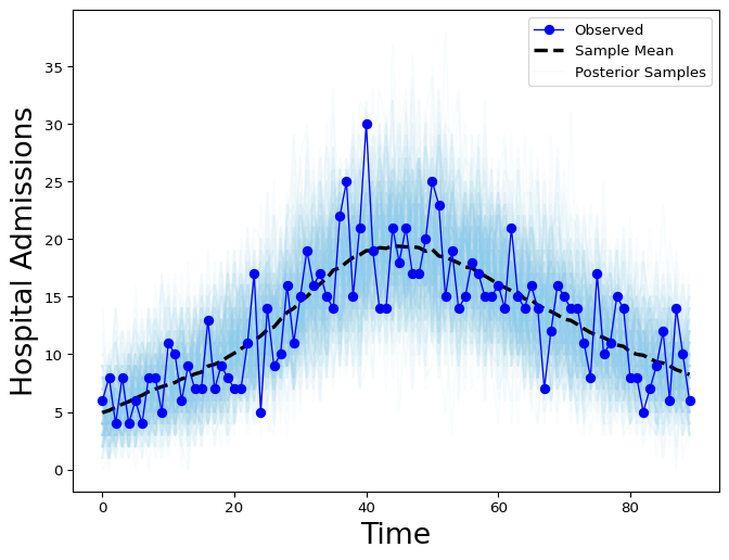
Figure 4: Latent hospital admissions posterior samples (gray) and observed admissions timeseries (red).
Results exploration and MCMC diagnostics
To explore further, we use arviz to visualize the results. We obtain
the summary of model diagnostics and print the diagnostics for
latent_hospital_admissions[1]
idata = az.from_numpyro(hosp_model.mcmc)

diagnostic_stats_summary = az.summary(
    idata.posterior,
    kind="diagnostics",
)

print(diagnostic_stats_summary.loc["latent_hospital_admissions[1]"])
mcse_mean       0.015
mcse_sd         0.013
ess_bulk     1603.000
ess_tail     1390.000
r_hat           1.000
Name: latent_hospital_admissions[1], dtype: float64
Below we plot 90% and 50% highest density intervals for latent hospital admissions using plot_hdi:
x_data = idata.posterior["latent_hospital_admissions_dim_0"]
y_data = idata.posterior["latent_hospital_admissions"]


fig, axes = plt.subplots(figsize=(6, 5))
az.plot_hdi(
    x_data,
    y_data,
    hdi_prob=0.9,
    color="C0",
    smooth=False,
    fill_kwargs={"alpha": 0.3},
    ax=axes,
)

az.plot_hdi(
    x_data,
    y_data,
    hdi_prob=0.5,
    color="C0",
    smooth=False,
    fill_kwargs={"alpha": 0.6},
    ax=axes,
)

# Add the posterior median to the figure
median_ts = y_data.median(dim=["chain", "draw"])

axes.plot(x_data, median_ts, color="C0", label="Median")
axes.legend()
axes.set_title("Posterior Hospital Admissions", fontsize=10)
axes.set_xlabel("Time", fontsize=10)
axes.set_ylabel("Hospital Admissions", fontsize=10)
plt.show()
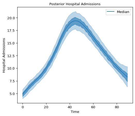
Figure 5: Hospital Admissions posterior distribution
We can also look at credible intervals for the posterior distribution of latent infections:
x_data = (
    idata.posterior["all_latent_infections_dim_0"] - n_initialization_points
)
y_data = idata.posterior["all_latent_infections"]

fig, axes = plt.subplots(figsize=(6, 5))
az.plot_hdi(
    x_data,
    y_data,
    hdi_prob=0.9,
    color="C0",
    smooth=False,
    fill_kwargs={"alpha": 0.3},
    ax=axes,
)

az.plot_hdi(
    x_data,
    y_data,
    hdi_prob=0.5,
    color="C0",
    smooth=False,
    fill_kwargs={"alpha": 0.6},
    ax=axes,
)

# Add the posterior median to the figure
median_ts = y_data.median(dim=["chain", "draw"])
axes.plot(x_data, median_ts, color="C0", label="Median")
axes.legend()
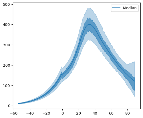
Figure 6: Posterior Latent Infections
Predictive checks and forecasting
We can use the Model’s posterior_predictive and prior_predictive
methods to generate posterior and prior predictive samples for observed
admissions.
idata = az.from_numpyro(
    hosp_model.mcmc,
    posterior_predictive=hosp_model.posterior_predictive(
        n_datapoints=len(daily_hosp_admits)
    ),
    prior=hosp_model.prior_predictive(
        n_datapoints=len(daily_hosp_admits),
        numpyro_predictive_args={"num_samples": 1000},
    ),
)
We will use plot_lm method from arviz to plot the posterior
predictive distribution against the actual observed data below:
fig, ax = plt.subplots()
az.plot_lm(
    "negbinom_rv",
    idata=idata,
    kind_pp="hdi",
    y_kwargs={"color": "black"},
    y_hat_fill_kwargs={"color": "C0"},
    axes=ax,
)

ax.set_title("Posterior Predictive Plot")
ax.set_ylabel("Hospital Admissions")
ax.set_xlabel("Days")
plt.show()
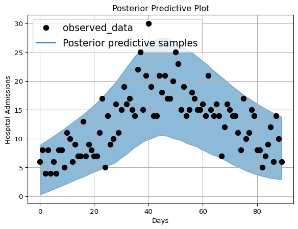
Figure 7: Hospital Admissions posterior distribution with plot_lm
By increasing n_datapoints, we can perform forecasting using the
posterior predictive distribution.
n_forecast_points = 28
idata = az.from_numpyro(
    hosp_model.mcmc,
    posterior_predictive=hosp_model.posterior_predictive(
        n_datapoints=len(daily_hosp_admits) + n_forecast_points,
    ),
    prior=hosp_model.prior_predictive(
        n_datapoints=len(daily_hosp_admits),
        numpyro_predictive_args={"num_samples": 1000},
    ),
)
Below we plot the prior predictive distributions using equal tailed Bayesian credible intervals:
def compute_eti(dataset, eti_prob):
    eti_bdry = dataset.quantile(
        ((1 - eti_prob) / 2, 1 / 2 + eti_prob / 2), dim=("chain", "draw")
    )
    return eti_bdry.T


fig, axes = plt.subplots(figsize=(6, 5))
az.plot_hdi(
    idata.prior_predictive["negbinom_rv_dim_0"],
    hdi_data=compute_eti(idata.prior_predictive["negbinom_rv"], 0.9),
    color="C0",
    smooth=False,
    fill_kwargs={"alpha": 0.3},
    ax=axes,
)

az.plot_hdi(
    idata.prior_predictive["negbinom_rv_dim_0"],
    hdi_data=compute_eti(idata.prior_predictive["negbinom_rv"], 0.5),
    color="C0",
    smooth=False,
    fill_kwargs={"alpha": 0.6},
    ax=axes,
)

plt.scatter(
    idata.observed_data["negbinom_rv_dim_0"],
    idata.observed_data["negbinom_rv"],
    color="black",
)

axes.set_title("Prior Predictive Admissions", fontsize=10)
axes.set_xlabel("Time", fontsize=10)
axes.set_ylabel("Observed Admissions", fontsize=10)
plt.yscale("log")
plt.show()
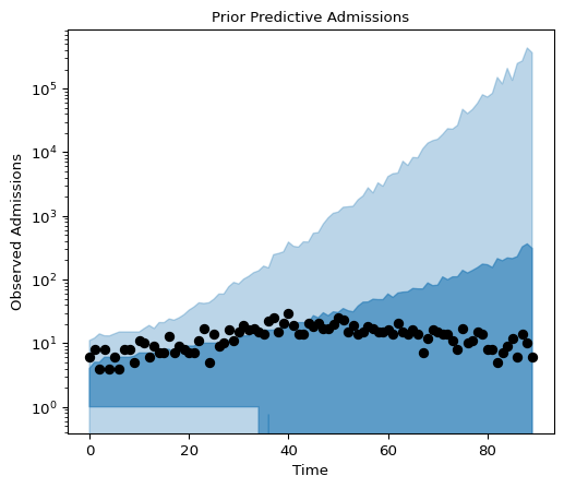
Figure 8: Prior Predictive Admissions
And now we plot the posterior predictive distributions with a 28-day-ahead forecast:
x_data = idata.posterior_predictive["negbinom_rv_dim_0"]
y_data = idata.posterior_predictive["negbinom_rv"]
fig, axes = plt.subplots(figsize=(6, 5))
az.plot_hdi(
    x_data,
    hdi_data=compute_eti(y_data, 0.9),
    color="C0",
    smooth=False,
    fill_kwargs={"alpha": 0.3},
    ax=axes,
)

az.plot_hdi(
    x_data,
    hdi_data=compute_eti(y_data, 0.5),
    color="C0",
    smooth=False,
    fill_kwargs={"alpha": 0.6},
    ax=axes,
)

# Add median of the posterior to the figure
median_ts = y_data.median(dim=["chain", "draw"])

plt.plot(
    x_data,
    median_ts,
    color="C0",
    label="Median",
)
plt.scatter(
    idata.observed_data["negbinom_rv_dim_0"],
    idata.observed_data["negbinom_rv"],
    color="black",
)
axes.legend()
axes.set_title(
    "Posterior Predictive Admissions, including a forecast", fontsize=10
)
axes.set_xlabel("Time", fontsize=10)
axes.set_ylabel("Hospital Admissions", fontsize=10)
plt.show()
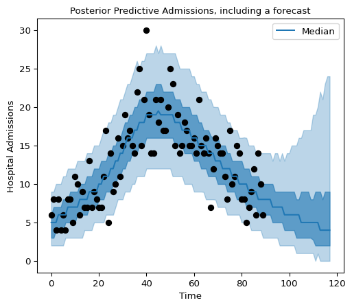
Figure 9: Posterior predictive admissions, including a forecast.