library(nowcastNHSN)
library(baselinenowcast)
library(ggplot2)
library(dplyr)
#>
#> Attaching package: 'dplyr'
#> The following objects are masked from 'package:stats':
#>
#>     filter, lag
#> The following objects are masked from 'package:base':
#>
#>     intersect, setdiff, setequal, union
Introduction
The nowcastNHSN package supports multiple data sources
for fetching vintaged NHSN reporting data. The Getting Started vignette demonstrates
using the Delphi Epidata API via delphi_epidata_source().
This vignette shows an alternative; pulling target timeseries data
directly from forecast hub cloud-mirrored S3 buckets using
hub_data_source() and the hubData package.
This approach is useful when you want to work directly with the data as it appears in the forecast hubs, rather than going through the Epidata API.
Creating a Hub Data Source
The hub_data_source() constructor takes the S3 bucket
name (S3 is a slightly overloaded term here) and the target for
filtering. For the COVID-19 Forecast Hub, the NHSN target is
"wk inc covid hosp":
# Create a hub data source for the COVID-19 Forecast Hub
source <- hub_data_source(
  hub_name = "covid19-forecast-hub",
  target = "wk inc covid hosp"
)
Fetching Reporting Data
The fetch_reporting_data() generic dispatches on the
source class, so the interface is the same as with
delphi_epidata_source(). The hub data uses FIPS location
codes internally, but the method converts these to lowercase two-letter
state abbreviations to match the common output schema.
We follow the forecast hub convention of using Saturdays as the
reference date for weekly data. The as_of column in the hub
data (which records when each vintage was published) is likewise
converted to the Saturday ending its MMWR epiweek, becoming the
report_date.
# Fetch data for California and New York
reporting_data <- fetch_reporting_data(
  source = source,
  reference_dates = "*",
  report_dates = "*",
  locations = c("ca", "ny")
)
When running this live, you will see a warning about duplicate
as_of dates: the hub data can have multiple observations
within the same MMWR epiweek (e.g. published on Monday and Wednesday),
which both map to the same Saturday report_date. By
default, dedup = "latest" keeps the most recent observation
per week. You can pass dedup = "earliest" to keep the first
instead:
# Alternative: keep the earliest observation per epiweek
reporting_data <- fetch_reporting_data(
  source = source,
  reference_dates = "*",
  report_dates = "*",
  locations = c("ca", "ny"),
  dedup = "earliest"
)
# View the first few rows
head(reporting_data)
#> # A tibble: 6 × 5
#>   reference_date report_date location count signal
#>   <date>         <date>      <chr>    <dbl> <chr>
#> 1 2024-11-09     2024-11-23  ca         611 wk inc covid hosp
#> 2 2024-11-09     2024-11-23  ny         416 wk inc covid hosp
#> 3 2024-11-09     2024-11-30  ca         603 wk inc covid hosp
#> 4 2024-11-09     2024-11-30  ny         417 wk inc covid hosp
#> 5 2024-11-09     2024-12-07  ca         609 wk inc covid hosp
#> 6 2024-11-09     2024-12-07  ny         417 wk inc covid hosp
The returned data frame has the same columns as the Delphi source:
-
reference_date: The Saturday ending the week when events occurred -
report_date: The Saturday ending the MMWR epiweek when the data was published -
location: Lowercase two-letter state abbreviation (or “us” for national) -
count: Reported count for that vintage -
signal: The hub target name
Visualizing Reporting Delays
As with the Delphi source, counts for the same reference date change across vintages. Let’s visualize this for California:
ca_data <- reporting_data |>
  filter(location == "ca")

# Pick a few report dates to compare
all_report_dates <- sort(unique(ca_data$report_date))
selected_report_dates <- c(
  all_report_dates[seq(1, length(all_report_dates) - 1, length.out = 4) |> round()],
  max(all_report_dates)
) |>
  unique() |>
  sort()

selected_reports <- ca_data |>
  filter(report_date %in% selected_report_dates)

ggplot(selected_reports, aes(x = reference_date, y = count, color = as.factor(report_date))) +
  geom_line(linewidth = 1) +
  geom_point(size = 2) +
  labs(
    title = "COVID-19 Hospital Admissions in California (Hub Data)",
    subtitle = "How reported counts change across data vintages",
    x = "Reference Date (Week Ending)",
    y = "Confirmed Admissions",
    color = "Report Date"
  ) +
  theme_minimal() +
  theme(legend.position = "bottom") +
  scale_color_brewer(palette = "Set1")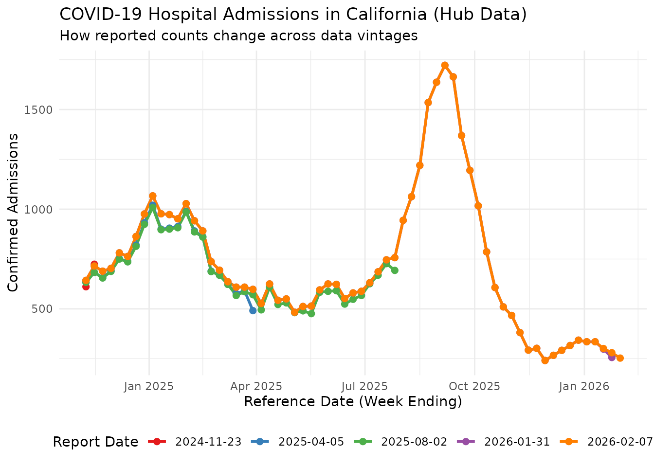
Preparing for Nowcasting
To use baselinenowcast, we need incremental counts (new
reports at each vintage) rather than the raw counts. We convert using
cumulative_to_incremental():
incremental_data <- cumulative_to_incremental(
reporting_data,
group_cols = c("reference_date", "location", "signal")
)
head(incremental_data)
#> # A tibble: 6 × 5
#> reference_date report_date location count signal
#> <date> <date> <chr> <dbl> <chr>
#> 1 2024-11-09 2024-11-23 ca 611 wk inc covid hosp
#> 2 2024-11-09 2024-11-23 ny 416 wk inc covid hosp
#> 3 2024-11-09 2024-11-30 ca -8 wk inc covid hosp
#> 4 2024-11-09 2024-11-30 ny 1 wk inc covid hosp
#> 5 2024-11-09 2024-12-07 ca 6 wk inc covid hosp
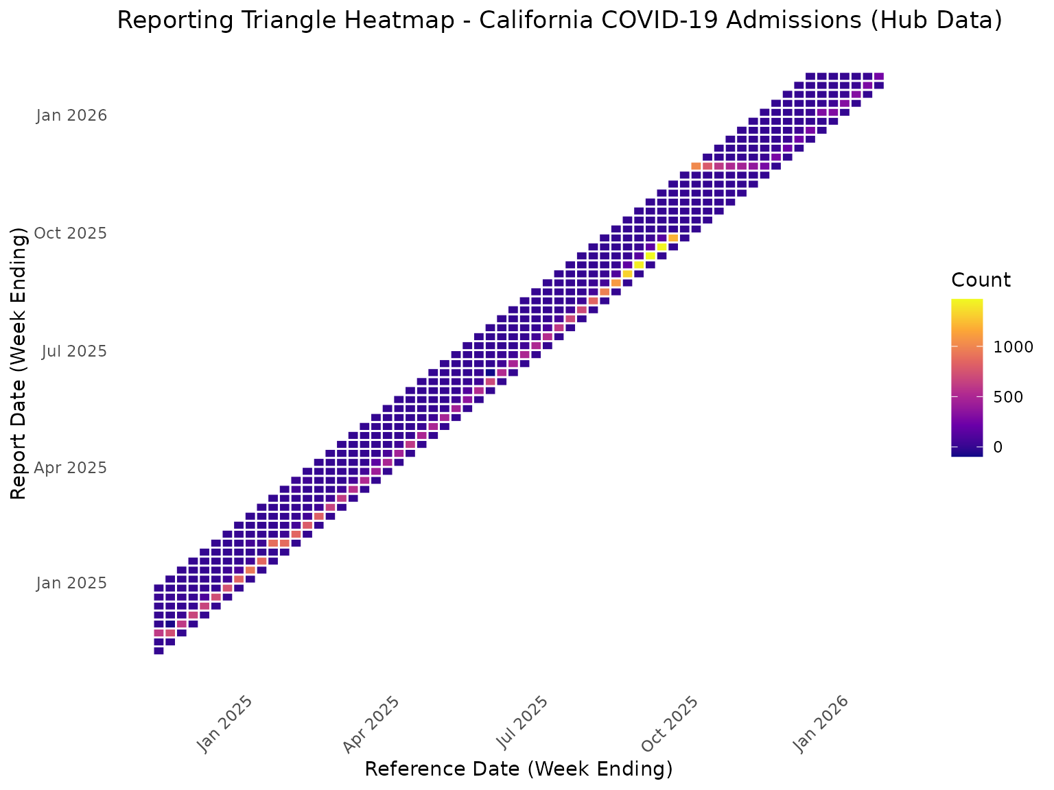
#> 6 2024-11-09 2024-12-07 ny 0 wk inc covid hospConverting to a Reporting Triangle
We filter to California and convert to a reporting triangle with a maximum delay of 7 weeks:
ca_incremental <- incremental_data |>
  filter(location == "ca")

nowcast_date <- max(ca_incremental$reference_date)
ca_incremental <- ca_incremental |>
  filter(report_date <= nowcast_date)

# Convert to reporting triangle format
reporting_triangle <- as_reporting_triangle(
  ca_incremental,
  delays_unit = "weeks"
) |>
  truncate_to_delay(max_delay = 7)

print(reporting_triangle)
#>            0   1   2  3  4  5  6  7
#> 2025-11-22 0 273  25  3  0  0  0  0
#> 2025-11-29 0 215  25  1  0  0  0  0
#> 2025-12-06 0 233  35  0  0  0  0  0
#> 2025-12-13 0 271   0 16  0  1  4  0
#> 2025-12-20 0   0 302  9  0  4  1 NA
#> 2025-12-27 0 301  37  2  3  0 NA NA
#> 2026-01-03 0 316  13  0  6 NA NA NA
#> 2026-01-10 0 316  16  3 NA NA NA NA
#> 2026-01-17 0 282  16 NA NA NA NA NA
#> 2026-01-24 0 256  NA NA NA NA NA NA
Heatmap View of Reporting Triangle
rt_data <- reporting_triangle |>
  as.data.frame() |>
  mutate(
    report_date = reference_date + delay * 7
  )

ggplot(rt_data, aes(x = reference_date, y = report_date, fill = count)) +
  geom_tile(color = "white", linewidth = 0.5) +
  scale_fill_viridis_c(option = "plasma", na.value = "grey90") +
  labs(
    title = "Reporting Triangle Heatmap - California COVID-19 Admissions (Hub Data)",
    x = "Reference Date (Week Ending)",
    y = "Report Date (Week Ending)",
    fill = "Count"
  ) +
  theme_minimal() +
  theme(
    axis.text.x = element_text(angle = 45, hjust = 1),
    panel.grid = element_blank()
  )
Fitting the Baseline Nowcast
With the reporting triangle ready, we fit the baseline nowcast model
using baselinenowcast defaults:
nowcast_fit <- baselinenowcast(reporting_triangle, draws = 100)Extracting and Visualizing Predictions
nowcast_predictions <- nowcast_fit |>
  group_by(reference_date) |>
  summarise(
    median = median(pred_count),
    q5 = quantile(pred_count, 0.05),
    q95 = quantile(pred_count, 0.95),
    .groups = "drop"
  )

latest_cumulative <- ca_incremental |>
  arrange(reference_date, report_date) |>
  group_by(reference_date) |>
  summarise(
    latest_count = sum(count),
    .groups = "drop"
  )

comparison <- nowcast_predictions |>
  left_join(latest_cumulative, by = "reference_date") |>
  mutate(
    reporting_completeness = (latest_count / median) * 100
  )

print(comparison |> select(reference_date, latest_count, median, q5, q95, reporting_completeness))
#> # A tibble: 64 × 6
#>    reference_date latest_count median    q5   q95 reporting_completeness
#>    <date>                <dbl>  <dbl> <dbl> <dbl>                  <dbl>
#>  1 2024-11-09              643    634   634   634                   101.
#>  2 2024-11-16              715    682   682   682                   105.
#>  3 2024-11-23              689    655   655   655                   105.
#>  4 2024-11-30              703    691   691   691                   102.
#>  5 2024-12-07              781    750   750   750                   104.
#>  6 2024-12-14              763    725   725   725                   105.
#>  7 2024-12-21              863    814   814   814                   106.
#>  8 2024-12-28              976    931   931   931                   105.
#>  9 2025-01-04             1067   1018  1018  1018                   105.
#> 10 2025-01-11              977    885   885   885                   110.
#> # ℹ 54 more rows
ggplot(comparison, aes(x = reference_date)) +
  geom_point(aes(y = latest_count, color = "Latest Reported"), size = 3) +
  geom_line(aes(y = latest_count, color = "Latest Reported"), linewidth = 1) +
  geom_point(aes(y = median, color = "Nowcast (Median)"), size = 3, shape = 17) +
  geom_line(aes(y = median, color = "Nowcast (Median)"), linewidth = 1, linetype = "dashed") +
  geom_ribbon(aes(ymin = q5, ymax = q95, fill = "90% Prediction Interval"), alpha = 0.3) +
  labs(
    title = "Baseline Nowcast for California COVID-19 Admissions (Hub Data)",
    subtitle = "Comparing latest reported counts with nowcast predictions",
    x = "Reference Date (Week Ending)",
    y = "Confirmed Admissions",
    color = "Count Type",
    fill = NULL
  ) +
  theme_minimal() +
  theme(legend.position = "bottom") +
  scale_color_manual(values = c("Latest Reported" = "#E41A1C", "Nowcast (Median)" = "#377EB8")) +
  scale_fill_manual(values = c("90% Prediction Interval" = "#377EB8"))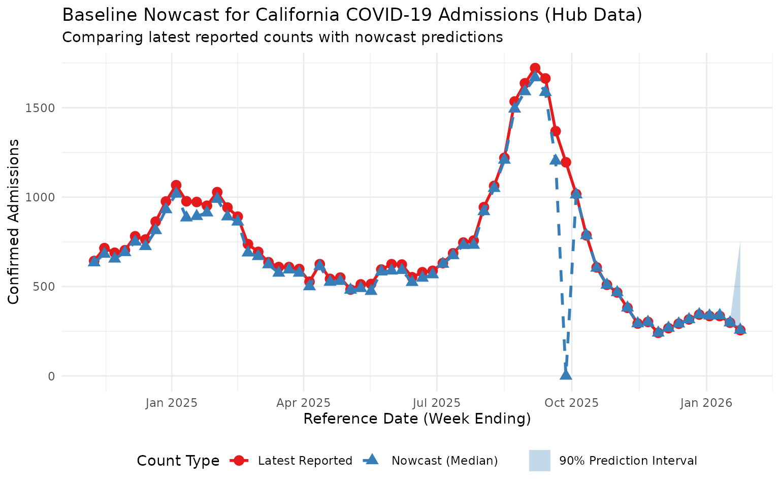
This plot shows the nowcast predictions adjusting for expected under-reporting in recent reference dates, using data sourced directly from the COVID-19 Forecast Hub S3 bucket. Note the influence of a substantial reporting delay in the middle of this time period.