library(nowcastNHSN)
library(baselinenowcast)
library(ggplot2)
library(dplyr)
#>
#> Attaching package: 'dplyr'
#> The following objects are masked from 'package:stats':
#>
#>     filter, lag
#> The following objects are masked from 'package:base':
#>
#>     intersect, setdiff, setequal, union
Introduction
The nowcastNHSN package provides tools for fetching and
doing inference with vintages of National Healthcare Safety Network
(NHSN) hospitalisation incidence data for Covid-19, Influenza and RSV.
The goal of nowcastNHSN is to help with forecasting these
signals in real-time, as new target data arrives in forecast hubs on a
mid-week (Wednesday) schedule, by offering easy access to various
methods of gathering historical reporting data and various approaches to
nowcasting NHSN data. This vignette demonstrates how to fetch NHSN
reporting data and prepare it for nowcasting analysis using the
baselinenowcast package.
Forecasting hubs:
Data Fetching Overview
Choosing a NHSN Data source
The primary function for fetching reporting data is
fetch_reporting_data(), which dispatches on different data
sources. In this vignette, we’ll focus on the EpiData
source, which provides historical versions of NHSN hospital admission
data maintained by the Delphi group at Carnegie Mellon University.
# Create a Delphi Epidata source for COVID-19 hospital admissions
source <- delphi_epidata_source(
  target = "covid",
  geo_types = "state"
)
Fetching Reporting Data
In nowcastNHSN, we follow the forecast hub convention of
using Saturdays as the reference date for weekly data. We’ll define the
time period and locations we want to fetch data for:
# Define reference dates as an epirange (YYYYWW format)
epiweeks <- epidatr::epirange(202450, 202527)

reference_dates <- epiweeks

# For report dates, use "*" to get all available issue dates
# This will retrieve the full reporting history
report_dates <- epidatr::epirange(202450, 202530)

# Fetch data for specific states (lowercase for epidata API)
locations <- c("ca", "ny")
Now we can fetch the reporting data and filter out any report dates that are too far in the future:
# Fetch the data
reporting_data <- fetch_reporting_data(
  source = source,
  reference_dates = reference_dates,
  report_dates = report_dates,
  locations = locations
)
#> Warning: No API key found. You will be limited to non-complex queries and encounter rate
#> limits if you proceed.
#> ℹ See `?save_api_key()` for details on obtaining and setting API keys.
#> This warning is displayed once every 8 hours.
# View the first few rows
head(reporting_data)
#> # A tibble: 6 × 5
#>   reference_date report_date count location signal
#>   <date>         <date>      <dbl> <chr>    <chr>
#> 1 2024-12-14     2024-12-21    715 ca       confirmed_admissions_covid_ew_prelim
#> 2 2024-12-14     2024-12-21    469 ny       confirmed_admissions_covid_ew_prelim
#> 3 2024-12-14     2024-12-28    722 ca       confirmed_admissions_covid_ew_prelim
#> 4 2024-12-14     2024-12-28    491 ny       confirmed_admissions_covid_ew_prelim
#> 5 2024-12-14     2025-01-04    722 ca       confirmed_admissions_covid_ew_prelim
#> 6 2024-12-14     2025-01-04    495 ny       confirmed_admissions_covid_ew_prelim
The returned data frame contains columns:
-
reference_date: The Saturday ending the week when events occurred -
report_date: The Saturday when the data was reported -
location: Geographic identifier (state abbreviation or “US”) -
count: Cumulative COVID-19 hospital admissions reported as of that report date -
signal: The epidata signal name
Visualizing Reporting Delays
A feature of reporting data is that counts for the same reference date can change as new reports come in. This backfilling of the data is a common challenge in using the latest data for real-time forecasting. Let’s visualize the vintage cumulative data to see how the time series of Californian Covid-19 hospitalisations evolves at different report dates:
# Use the cumulative data directly from the API for vintage visualization
# Select a few report dates to compare
# Pick 4 evenly spaced report dates plus the latest to show evolution over time
all_report_dates <- sort(unique(reporting_data$report_date[reporting_data$location == "ca"]))
selected_report_dates <- c(
  all_report_dates[seq(1, length(all_report_dates) - 1, length.out = 4) |> round()],
  max(all_report_dates)  # Always include the latest report date
) |>
  unique() |>
  sort()

selected_reports <- reporting_data |>
  filter(
    location == "ca",
    report_date %in% selected_report_dates
  )

# Create the plot using the cumulative counts directly from the API
ggplot(selected_reports, aes(x = reference_date, y = count, color = as.factor(report_date))) +
  geom_line(linewidth = 1) +
  geom_point(size = 2) +
  scale_y_log10() +
  labs(
    title = "COVID-19 Hospital Admissions in California",
    subtitle = "How reported counts change as data is updated (cumulative totals)",
    x = "Reference Date (Week Ending)",
    y = "Confirmed Admissions (log scale)",
    color = "Report Date"
  ) +
  theme_minimal() +
  theme(legend.position = "bottom") +
  scale_color_brewer(palette = "Set1")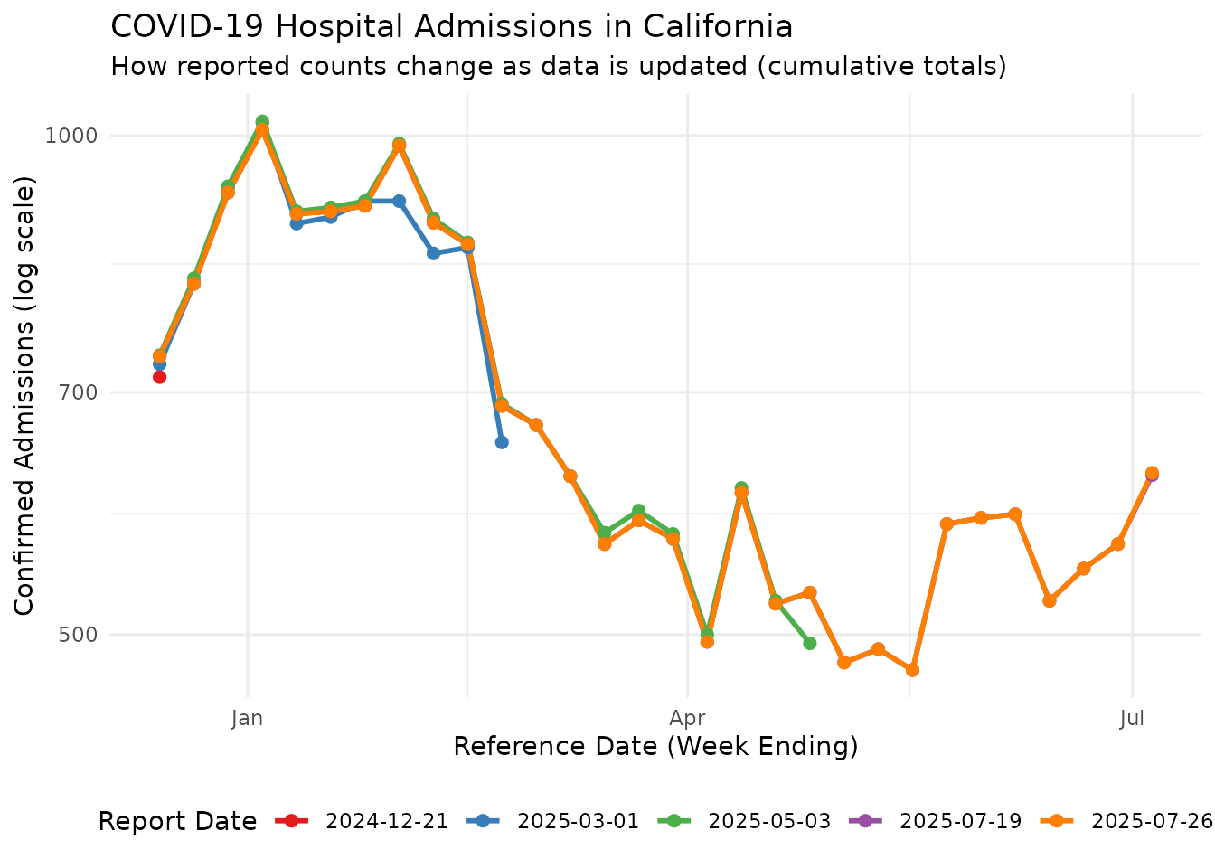
This plot shows how the same reference dates can have different reported counts depending on when the data was reported. Counts for reference dates that are recent to their report date may be incomplete, and typically get revised upward in subsequent reports, but note that downward revisions also occur.
Note that reporting_data are the total reported counts
at various reference dates and report dates. For nowcasting with
baselinenowcast, we need incremental counts (new reports at
each report date). We can convert using
cumulative_to_incremental():
# Convert cumulative counts to incremental counts
incremental_reporting_data <- cumulative_to_incremental(
  reporting_data,
  group_cols = c("reference_date", "location", "signal")
)
head(reporting_data)
#> # A tibble: 6 × 5
#>   reference_date report_date count location signal
#>   <date>         <date>      <dbl> <chr>    <chr>
#> 1 2024-12-14     2024-12-21    715 ca       confirmed_admissions_covid_ew_prelim
#> 2 2024-12-14     2024-12-21    469 ny       confirmed_admissions_covid_ew_prelim
#> 3 2024-12-14     2024-12-28    722 ca       confirmed_admissions_covid_ew_prelim
#> 4 2024-12-14     2024-12-28    491 ny       confirmed_admissions_covid_ew_prelim
#> 5 2024-12-14     2025-01-04    722 ca       confirmed_admissions_covid_ew_prelim
#> 6 2024-12-14     2025-01-04    495 ny       confirmed_admissions_covid_ew_prelim
Converting to a Reporting Triangle
To perform nowcasting analysis, we need to convert the fetched
reporting data into a reporting triangle format, which organizes counts
by reference date and delay. We use the
baselinenowcast::as_reporting_triangle() function to do
this. The data from fetch_reporting_data() is already in
the long format required by
baselinenowcast::as_reporting_triangle(), and we have
converted to incremental. The reporting triangle can be set to have a
maximum delay, and in this example we treat 7 weeks as the maximum
period over which new reports for a reference date can arrive.
# Filter to a single location (California) for the reporting triangle
ca_data <- incremental_reporting_data |>
  filter(location == "ca")

nowcast_date <- max(ca_data$reference_date)
ca_data <- ca_data |>
  filter(report_date <= nowcast_date)

# Convert to reporting triangle format
reporting_triangle <- as_reporting_triangle(
  ca_data,
  delays_unit = "weeks"
) |>
  truncate_to_delay(max_delay = 7)

# View the reporting triangle structure
print(reporting_triangle)
#>            0   1   2  3  4  5  6  7
#> 2025-04-19 0 500  24  1  0  0  0  0
#> 2025-04-26 0 494  32  2  0  0  3 -1
#> 2025-05-03 0 479   7 -3  0  0 -2  0
#> 2025-05-10 0 449  33  1 11 -4  0  0
#> 2025-05-17 0 359 109  8 -3  0  0 NA
#> 2025-05-24 0 535  36 12  0  0 NA NA
#> 2025-05-31 0 680 -96 -3  7 NA NA NA
#> 2025-06-07 0 528  47 15 NA NA NA NA
#> 2025-06-14 0 482  36 NA NA NA NA NA
#> 2025-06-21 0 505  NA NA NA NA NA NA
The reporting triangle is now ready for nowcasting analysis using the
baselinenowcast package. Again, note that, although the
overall pattern is that most reports for a reference date occur at lags
of 1-2 weeks as upward revisions, downward revisions also occur and are
seen as negative values in the reporting triangle.
Heatmap View of Reporting Triangle
A heatmap provides another useful way to visualize the reporting triangle structure, showing when case counts for a reference date are reported relative to the reference date over a range of delays and report dates:
# Extract data from reporting triangle for visualization
rt_data <- reporting_triangle |>
  as.data.frame() |>
  mutate(
    # Convert delay back to report_date for the heatmap
    report_date = reference_date + delay * 7  # delay is in weeks
  )

ggplot(rt_data, aes(x = reference_date, y = report_date, fill = count)) +
  geom_tile(color = "white", linewidth = 0.5) +
  scale_fill_viridis_c(option = "plasma", na.value = "grey90") +
  labs(
    title = "Reporting Triangle Heatmap - California COVID-19 Admissions",
    subtitle = "Each cell shows the count reported for a reference date as of a report date",
    x = "Reference Date (Week Ending)",
    y = "Report Date (Week Ending)",
    fill = "Count"
  ) +
  theme_minimal() +
  theme(
    axis.text.x = element_text(angle = 45, hjust = 1),
    panel.grid = element_blank()
  )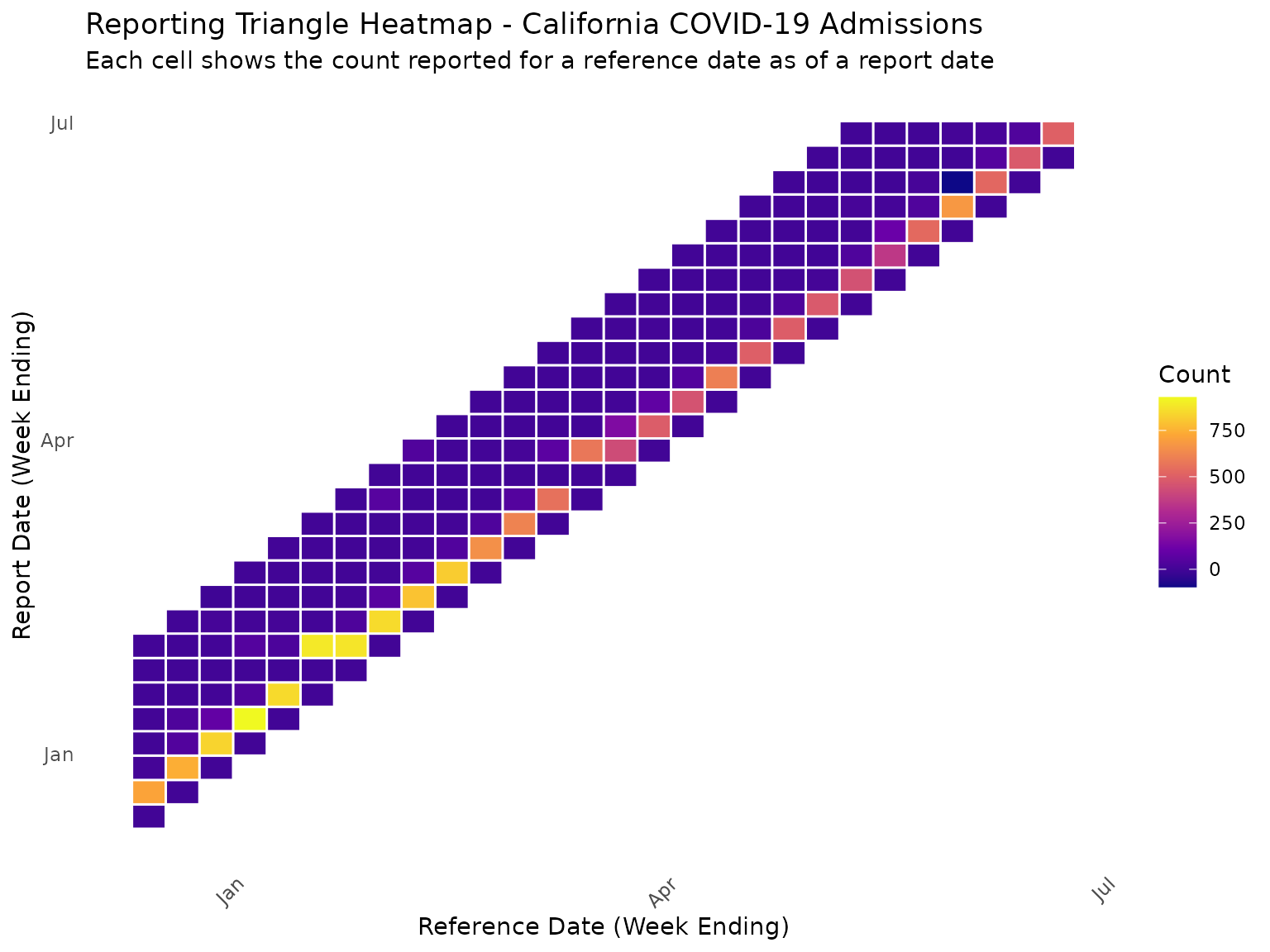
In this heatmap, the diagonal represents the count reported on the reference date itself, which for NHSN is always zero. Values above the diagonal show when reports for a historical reference date are made in subsequent weeks.
Using baselinenowcast for Nowcasting
The baselinenowcast package provides a simple baseline
model for nowcasting reporting triangles; see
here for details. Now that we have our reporting triangle, we can
use it to generate nowcasts that estimate the final count for recent
reference dates that are likely still under-reported.
Fitting the Baseline Nowcast Model
The baseline nowcast model fits an empirical delay distribution to the reporting triangle which creates a point prediction for the expected final count using a “chain ladder” of multipliers. The point predictions are converted into sampled probabilistic nowcasts by fitting past residuals to a chosen parameteric model, with the default being a negative binomial with mean fixed at the point estimate; see mathematical methods for details. We can fit the model and generate predictions as follows:
# Fit the baseline nowcast model
nowcast_fit <- baselinenowcast(reporting_triangle, draws = 100)
Extracting Nowcast Predictions
The nowcast object contains predictions for each reference date. We can extract these predictions and compare them to the latest reported counts:
# Extract the nowcast predictions by summarizing the draws
nowcast_predictions <- nowcast_fit |>
  group_by(reference_date) |>
  summarise(
    median = median(pred_count),
    q05 = quantile(pred_count, 0.05),
    q95 = quantile(pred_count, 0.95),
    .groups = "drop"
  )

# The nowcast predicts the FINAL CUMULATIVE count for each reference date.
# Get the latest reported cumulative count directly from the original data,
# filtered to the same nowcast_date used for the triangle.
latest_cumulative <- reporting_data |>
  filter(location == "ca", report_date <= nowcast_date) |>
  group_by(reference_date) |>
  filter(report_date == max(report_date)) |>
  ungroup() |>
  select(reference_date, latest_count = count)

# Also get the "final" counts from the most recent report date available
# (after the nowcast date) to evaluate nowcast performance
final_cumulative <- reporting_data |>
  filter(location == "ca") |>
  group_by(reference_date) |>
  filter(report_date == max(report_date)) |>
  ungroup() |>
  select(reference_date, final_count = count)

comparison <- nowcast_predictions |>
  left_join(latest_cumulative, by = "reference_date") |>
  left_join(final_cumulative, by = "reference_date") |>
  mutate(
    reporting_completeness = (latest_count / median) * 100
  )

# View the comparison
print(comparison |> select(reference_date, latest_count, median, q05, q95, final_count, reporting_completeness))
#> # A tibble: 28 × 7
#>    reference_date latest_count median   q05   q95 final_count
#>    <date>                <dbl>  <dbl> <dbl> <dbl>       <dbl>
#>  1 2024-12-14              736    725   725   725         736
#>  2 2024-12-21              814    814   814   814         814
#>  3 2024-12-28              924    931   931   931         924
#>  4 2025-01-04             1008   1018  1018  1018        1008
#>  5 2025-01-11              897    885   885   885         897
#>  6 2025-01-18              900    893   893   893         900
#>  7 2025-01-25              907    913   913   913         907
#>  8 2025-02-01              986    968   968   968         986
#>  9 2025-02-08              886    891   891   891         886
#> 10 2025-02-15              860    862   862   862         860
#> # ℹ 18 more rows
#> # ℹ 1 more variable: reporting_completeness <dbl>
Visualizing Nowcast Results
We can visualize the nowcast results by plotting the predicted final counts alongside the latest reported counts:
ggplot(comparison, aes(x = reference_date)) +
  # Nowcast uncertainty (draw first so it's behind)
  geom_ribbon(aes(ymin = q05, ymax = q95, fill = "90% Prediction Interval"), alpha = 0.3) +
  # Latest reported counts (at nowcast time)
  geom_point(aes(y = latest_count, color = "At Nowcast Time"), size = 3) +
  geom_line(aes(y = latest_count, color = "At Nowcast Time"), linewidth = 1) +
  # Nowcast median
  geom_point(aes(y = median, color = "Nowcast (Median)"), size = 3, shape = 17) +
  geom_line(aes(y = median, color = "Nowcast (Median)"), linewidth = 1, linetype = "dashed") +
  # Final reported counts (truth)
  geom_point(aes(y = final_count, color = "Final Reported"), size = 3, shape = 15) +
  geom_line(aes(y = final_count, color = "Final Reported"), linewidth = 1, linetype = "dotted") +
  labs(
    title = "Baseline Nowcast for California COVID-19 Admissions",
    subtitle = "Comparing nowcast predictions with counts at nowcast time and final reported values",
    x = "Reference Date (Week Ending)",
    y = "Confirmed Admissions",
    color = "Count Type",
    fill = NULL
  ) +
  theme_minimal() +
  theme(legend.position = "bottom") +
  scale_color_manual(values = c(
    "At Nowcast Time" = "#E41A1C",
    "Nowcast (Median)" = "#377EB8",
    "Final Reported" = "#4DAF4A"
  )) +
  scale_fill_manual(values = c("90% Prediction Interval" = "#377EB8"))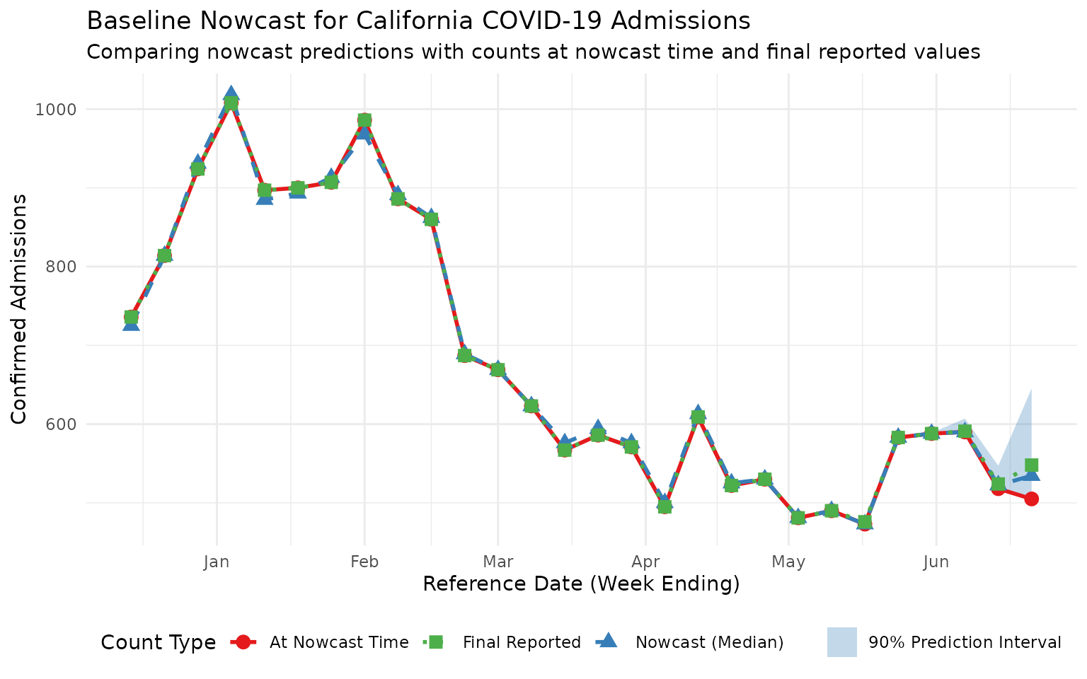
This plot shows three series:
- At Nowcast Time (red circles): The incomplete counts available when the nowcast was made
- Nowcast (Median) (blue triangles): The model’s prediction of final counts
- Final Reported (green squares): The actual final counts from the latest available data
For recent reference dates, the nowcast predictions should be closer to the final reported values than the incomplete counts at nowcast time, demonstrating the value of nowcasting.
Understanding Reporting Completeness
We can also visualize the estimated reporting completeness over time to identify which reference dates are most affected by reporting delays:
ggplot(comparison, aes(x = reference_date, y = reporting_completeness)) +
  geom_line(linewidth = 1, color = "#4DAF4A") +
  geom_point(size = 3, color = "#4DAF4A") +
  geom_hline(yintercept = 100, linetype = "dashed", color = "grey50") +
  labs(
    title = "Estimated Reporting Completeness Over Time",
    subtitle = "Percentage of final count already reported (latest count / nowcast median)",
    x = "Reference Date (Week Ending)",
    y = "Reporting Completeness (%)"
  ) +
  scale_y_continuous(limits = c(0, 110), breaks = seq(0, 100, 20)) +
  theme_minimal()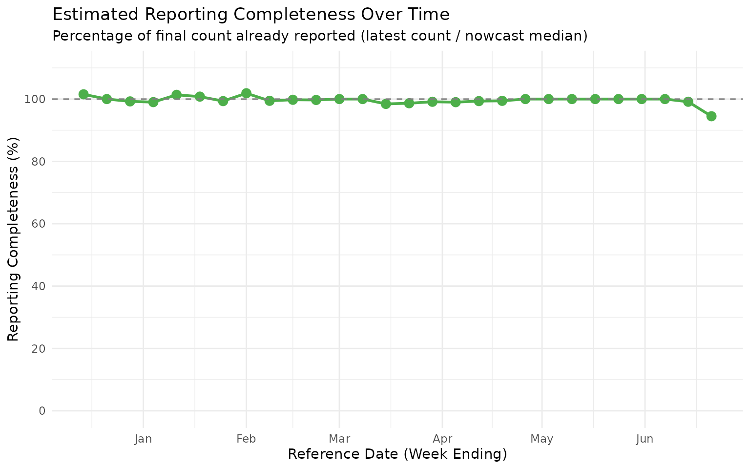
This completeness plot shows that the most recent reference dates typically have lower reporting completeness, as expected. For forecasting applications, the nowcast estimates can be used to adjust for this expected under-reporting when generating predictions.
Custom Uncertainty Models
As mentioned above, the baselinenowcast package samples
reference date/lag realisations from the nowcast model using a
combination of a point prediction and a fitted parametric distribution
for residuals, which by default is a negative binomial. In
nowcastNHSN we provide some alternative uncertainty models
that may be more appropriate for different data characteristics. In
particular, sometimes we see downwards revisions to NHSN data which have
probability zero under a negative binomial model.
nowcastNHSN provides dispersion fits and sampling for two
distributions that can sample negative integer values: the rounded
normal and the Skellam distributions; these operate well with the main
baselinenowcast inference function.
Using Normal Distribution for Uncertainty
The normal distribution (rounded to integers) provides a simple
symmetric uncertainty model. We use fit_by_horizon() from
baselinenowcast with our custom fit_normal function:
# Nowcast using normal distribution for uncertainty
nowcast_normal <- baselinenowcast(
  reporting_triangle,
  draws = 100,
  uncertainty_model = function(obs, pred) {
    fit_by_horizon(obs, pred, fit_model = fit_normal)
  },
  uncertainty_sampler = sample_normal
)

# Summarize the normal nowcast
normal_summary <- nowcast_normal |>
  group_by(reference_date) |>
  summarise(
    median = median(pred_count),
    q05 = quantile(pred_count, 0.05),
    q95 = quantile(pred_count, 0.95),
    .groups = "drop"
  ) |>
  mutate(model = "Normal")

print(normal_summary)
#> # A tibble: 28 × 5
#>    reference_date median   q05   q95 model
#>    <date>          <dbl> <dbl> <dbl> <chr>
#>  1 2024-12-14        725   725   725 Normal
#>  2 2024-12-21        814   814   814 Normal
#>  3 2024-12-28        931   931   931 Normal
#>  4 2025-01-04       1018  1018  1018 Normal
#>  5 2025-01-11        885   885   885 Normal
#>  6 2025-01-18        893   893   893 Normal
#>  7 2025-01-25        913   913   913 Normal
#>  8 2025-02-01        968   968   968 Normal
#>  9 2025-02-08        891   891   891 Normal
#> 10 2025-02-15        862   862   862 Normal
#> # ℹ 18 more rows
Using Skellam Distribution for Uncertainty
The Skellam distribution is the difference of two Poisson random variables, making it naturally suited for count data. It produces integer samples directly and can handle cases where deviations might be negative:
# Nowcast using Skellam distribution for uncertainty
nowcast_skellam <- baselinenowcast(
  reporting_triangle,
  draws = 100,
  uncertainty_model = function(obs, pred) {
    fit_by_horizon(obs, pred, fit_model = fit_skellam)
  },
  uncertainty_sampler = sample_skellam
)

# Summarize the Skellam nowcast
skellam_summary <- nowcast_skellam |>
  group_by(reference_date) |>
  summarise(
    median = median(pred_count),
    q05 = quantile(pred_count, 0.05),
    q95 = quantile(pred_count, 0.95),
    .groups = "drop"
  ) |>
  mutate(model = "Skellam")

print(skellam_summary)
#> # A tibble: 28 × 5
#>    reference_date median   q05   q95 model
#>    <date>          <dbl> <dbl> <dbl> <chr>
#>  1 2024-12-14        725   725   725 Skellam
#>  2 2024-12-21        814   814   814 Skellam
#>  3 2024-12-28        931   931   931 Skellam
#>  4 2025-01-04       1018  1018  1018 Skellam
#>  5 2025-01-11        885   885   885 Skellam
#>  6 2025-01-18        893   893   893 Skellam
#>  7 2025-01-25        913   913   913 Skellam
#>  8 2025-02-01        968   968   968 Skellam
#>  9 2025-02-08        891   891   891 Skellam
#> 10 2025-02-15        862   862   862 Skellam
#> # ℹ 18 more rows
Comparing Uncertainty Models
Let’s visualize how the different uncertainty models compare:
# Combine summaries
all_summaries <- rbind(
  normal_summary,
  skellam_summary
)

ggplot(all_summaries, aes(x = reference_date)) +
  # Latest reported counts
  geom_point(
    data = comparison,
    aes(y = latest_count, color = "Latest Reported"),
    size = 3
  ) +
  geom_line(
    data = comparison,
    aes(y = latest_count, color = "Latest Reported"),
    linewidth = 1
  ) +
  # Nowcast uncertainty ribbons
  geom_ribbon(
    data = normal_summary,
    aes(ymin = q05, ymax = q95, fill = "Normal"),
    alpha = 0.3
  ) +
  geom_ribbon(
    data = skellam_summary,
    aes(ymin = q05, ymax = q95, fill = "Skellam"),
    alpha = 0.3
  ) +
  # Nowcast medians (use normal_summary since medians are the same)
  geom_point(
    data = normal_summary,
    aes(y = median, color = "Nowcast (Median)"),
    size = 3, shape = 17
  ) +
  geom_line(
    data = normal_summary,
    aes(y = median, color = "Nowcast (Median)"),
    linewidth = 1, linetype = "dashed"
  ) +
  labs(
    title = "Comparison of Uncertainty Models",
    subtitle = "Comparing Normal vs Skellam prediction intervals",
    x = "Reference Date (Week Ending)",
    y = "Confirmed Admissions",
    color = "Count Type",
    fill = "90% Prediction Interval"
  ) +
  theme_minimal() +
  theme(legend.position = "bottom") +
  scale_color_manual(values = c("Latest Reported" = "#E41A1C", "Nowcast (Median)" = "#377EB8")) +
  scale_fill_manual(values = c("Normal" = "#377EB8", "Skellam" = "#4DAF4A"))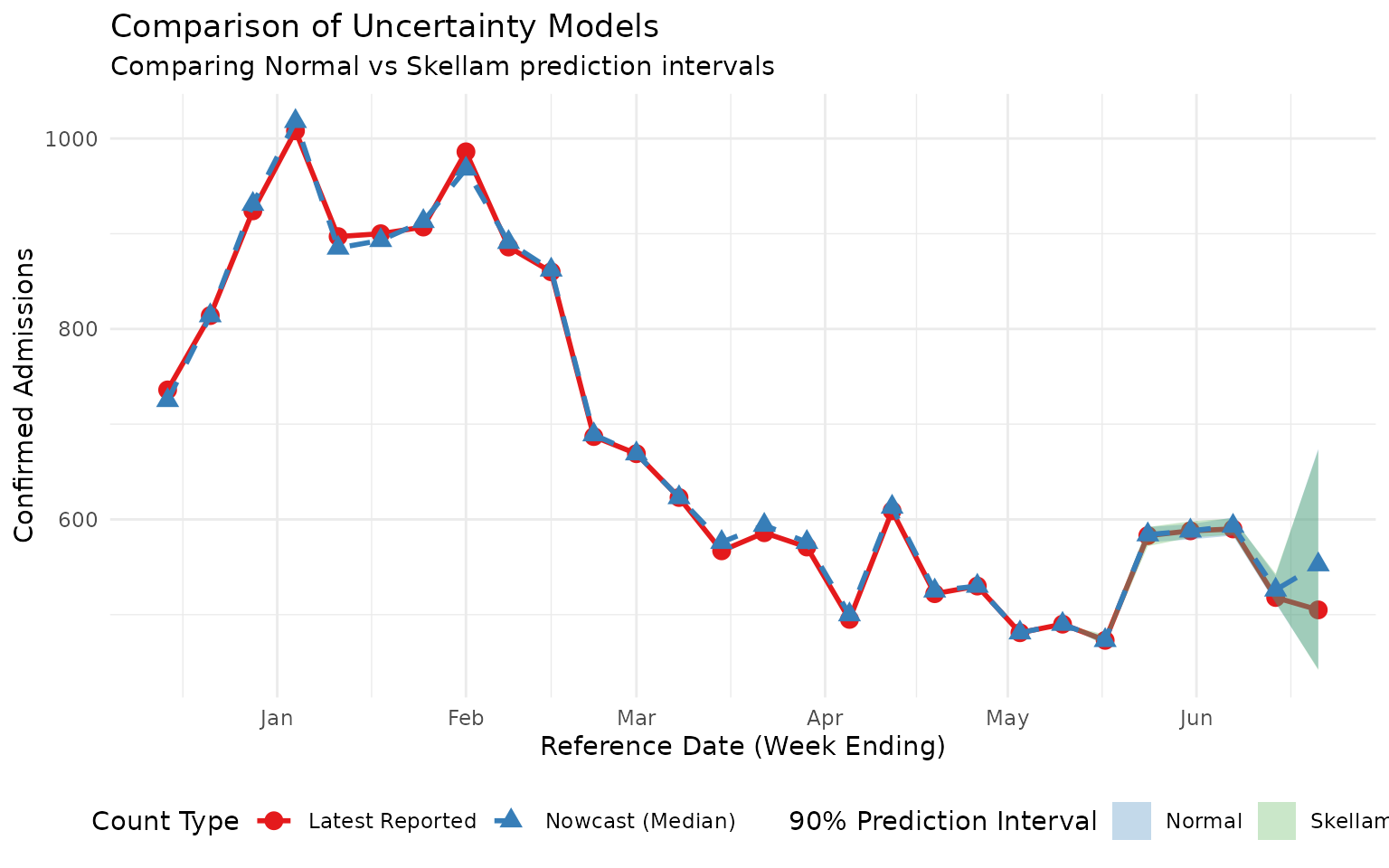
Note that both custom sampling distributions are capable of sampling down-revisions, albeit with different dispersion. The Skellam distribution is constrained to have higher variance than mean so is probably a better model for situations with low counts and fairly common down-revisions. The normal distribution (rounded) probably works better for larger counts with rare down-revisions.