Anomaly Detection and Trend Classification
Source:vignettes/Rnssp_trend_alert_detection.Rmd
Rnssp_trend_alert_detection.RmdIntroduction
In this tutorial, we describe how to perform anomaly detection and trend classification analysis using time series data from NSSP-ESSENCE. This vignette uses time series data from NSSP-ESSENCE data source for the CLI CC with CLI DD and Coronavirus DD v2 definition, limiting to ED visits (Has been Emergency = “Yes”).
We start this tutorial by loading the Rnssp package and
all other necessary packages.
The next step is to create a user profile with our NSSP-ESSENCE credentials.
# Creating an ESSENCE user profile
myProfile <- create_profile()

# save profile object to file for future use
# save(myProfile, "myProfile.rda") # saveRDS(myProfile, "myProfile.rds")
# Load profile object
# load("myProfile.rda") # myProfile <- readRDS("myProfile.rds")
Data Pull from NSSP-ESSENCE
Using the myProfile object, we authenticate to
NSSP-ESSENCE and pull in the data using the Time series data table
API.
url <- "https://essence2.syndromicsurveillance.org/nssp_essence/api/timeSeries?endDate=20Nov20&ccddCategory=cli%20cc%20with%20cli%20dd%20and%20coronavirus%20dd%20v2&percentParam=ccddCategory&geographySystem=hospitaldhhsregion&datasource=va_hospdreg&detector=probrepswitch&startDate=22Aug20&timeResolution=daily&hasBeenE=1&medicalGroupingSystem=essencesyndromes&userId=2362&aqtTarget=TimeSeries&stratVal=&multiStratVal=geography&graphOnly=true&numSeries=0&graphOptions=multipleSmall&seriesPerYear=false&nonZeroComposite=false&removeZeroSeries=true&startMonth=January&stratVal=&multiStratVal=geography&graphOnly=true&numSeries=0&graphOptions=multipleSmall&seriesPerYear=false&startMonth=January&nonZeroComposite=false"

# Data Pull from NSSP-ESSENCE
api_data <- get_api_data(url, profile = myProfile)
df <- api_data %>%
  pluck("timeSeriesData")

# glimpse(df)
First, let’s group the data by HHS regions
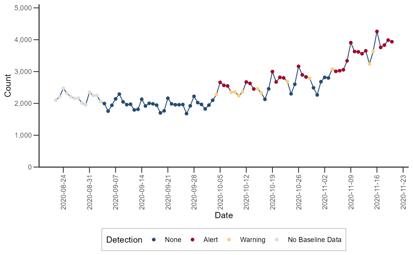
Anomaly Detection
Exponentially Weighted Moving Average (EWMA)
The Exponentially Weighted Moving Average (EWMA) compares a weighted
average of the most recent visit counts to a baseline expectation. For
the weighted average to be tested, an exponential weighting gives the
most influence to the most recent observations. This algorithm is
appropriate for daily counts that do not have the characteristic
features modeled in the regression algorithm. It is more applicable for
Emergency Department data from certain hospital groups and for time
series with small counts (daily average below 10) because of the limited
case definition or chosen geographic region. The EWMA detection
algorithm can be performed with alert_ewma() function (run
help(alert_ewma) or ?alert_ewma in the R
console for more).
df_ewma <- alert_ewma(df_hhs, t = date, y = dataCount)Let’s visualize the time series with the anomalies for Region 4:
# Filter the dataset
df_ewma_region <- df_ewma %>%
  filter(hospitaldhhsregion_display == "Region 4") %>%
  mutate(alert = factor(alert, levels = c("blue", "red", "yellow", "grey")))

# Plot time series data
ggplot(data = df_ewma_region) +
  geom_line(aes(x = date, y = dataCount), color = "#254B73") +
  geom_point(aes(x = date, y = dataCount, color = alert)) +
  scale_color_manual(
    values = c("#254B73", "#A50026", "#FDD081", "#DDDDDD"),
    name = "Detection",
    labels = c("None", "Alert", "Warning", "No Baseline Data")
  ) +
  scale_y_continuous(
    limits = c(0, NA),
    expand = expansion(c(0, 0.2)),
    labels = scales::comma,
    name = "Count"
  ) +
  scale_x_date(
    date_breaks = "1 week",
    name = "Date"
  ) +
  theme_classic() +
  theme(
    axis.text.x = element_text(angle = 90, vjust = 0.5),
    legend.position = "bottom",
    axis.ticks.length = unit(0.25, "cm"),
    legend.background = element_rect(color = "black", linewidth = 0.1)
  )
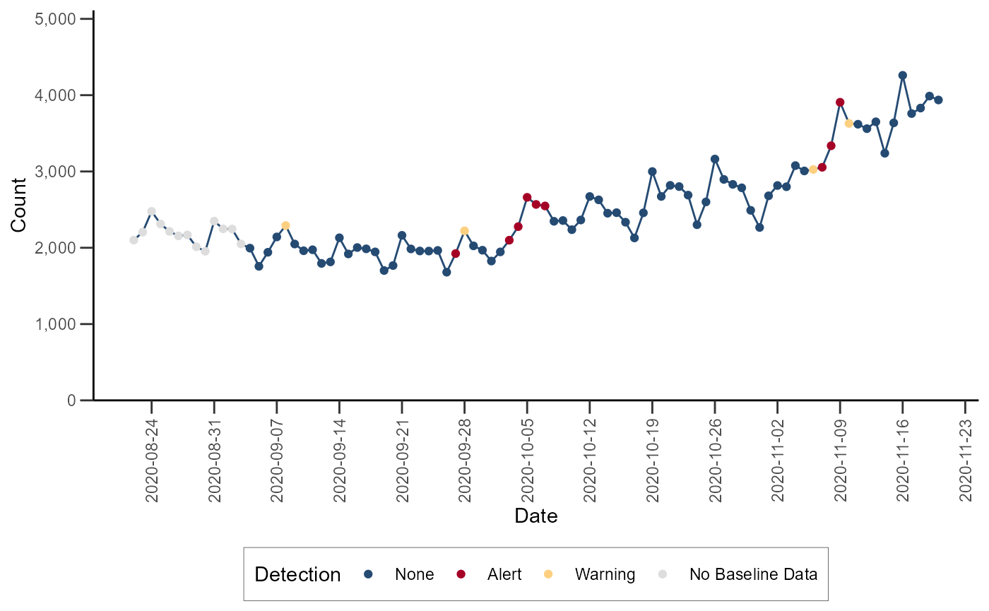
Adaptive Multiple Regression
The Adaptive Multiple Regression algorithm fits a linear model to a
baseline of counts or percentages, and forecasts a predicted value for
test dates following a pre-defined buffer period following the baseline.
This model includes terms to account for linear trends and day-of-week
effects. This implementation does NOT include holiday terms as in the
Regression 1.4 algorithm in NSSP-ESSENCE. The EWMA detection algorithm
can be performed with the alert_regression() function (run
help(alert_regression) or ?alert_regression in
the R console for more).
df_regression <- alert_regression(df_hhs, t = date, y = dataCount)Let’s visualize the time series with the anomalies for Region 4:
# Filter the dataset
df_regression_region <- df_regression %>%
  filter(hospitaldhhsregion_display == "Region 4") %>%
  mutate(alert = factor(alert, levels = c("blue", "red", "yellow", "grey")))

# Plot time series data
ggplot(data = df_regression_region) +
  geom_line(aes(x = date, y = dataCount), color = "#254B73") +
  geom_point(aes(x = date, y = dataCount, color = alert)) +
  scale_color_manual(
    values = c("#254B73", "#A50026", "#FDD081", "#DDDDDD"),
    name = "Detection",
    labels = c("None", "Alert", "Warning", "No Baseline Data")
  ) +
  scale_y_continuous(
    limits = c(0, NA),
    expand = expansion(c(0, 0.2)),
    labels = scales::comma,
    name = "Count"
  ) +
  scale_x_date(
    date_breaks = "1 week",
    name = "Date"
  ) +
  theme_classic() +
  theme(
    axis.text.x = element_text(angle = 90, vjust = 0.5),
    legend.position = "bottom",
    axis.ticks.length = unit(0.25, "cm"),
    legend.background = element_rect(color = "black", linewidth = 0.1)
  )
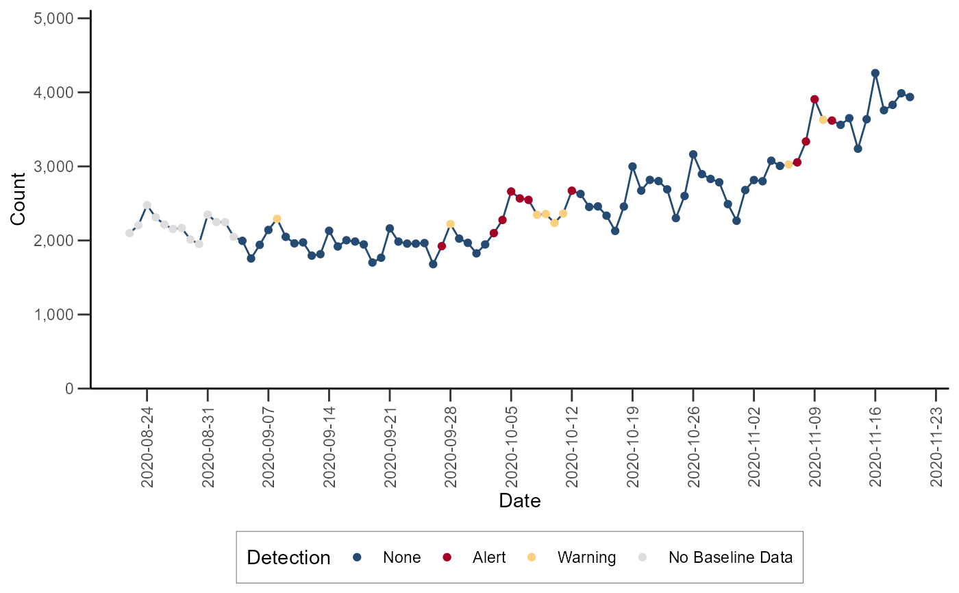
Regression/EWMA Switch
The NSSP-ESSENCE Regression/EWMA Switch algorithm generalized the Regression and EWMA algorithms by applying the most appropriate algorithm for the data in the baseline. First, adaptive multiple regression is applied where the adjusted R-squared value of the model is examined to see if it meets a threshold of \(>= 0.60\). If this threshold is not met, then the model is considered to not explain the data well. In this case, the algorithm switches to the EWMA algorithm, which is more appropriate for sparser time series that are common with granular geographic levels.
The Regression/EWMA algorithm can be performed with the
alert_switch() function (run
help(alert_switch) or ?alert_switch in the R
console for more).
df_switch <- alert_switch(df_hhs, t = date, y = dataCount)Let’s visualize the time series with the anomalies for Region 4:
# Filter the dataset
df_switch_region <- df_switch %>%
  filter(hospitaldhhsregion_display == "Region 4") %>%
  mutate(alert = factor(alert, levels = c("blue", "red", "yellow", "grey")))

# Plot time series data
ggplot(data = df_switch_region) +
  geom_line(aes(x = date, y = dataCount), color = "#254B73") +
  geom_point(aes(x = date, y = dataCount, color = alert)) +
  scale_color_manual(
    values = c("#254B73", "#A50026", "#FDD081", "#DDDDDD"),
    name = "Detection",
    labels = c("None", "Alert", "Warning", "No Baseline Data")
  ) +
  scale_y_continuous(
    limits = c(0, NA),
    expand = expansion(c(0, 0.2)),
    labels = scales::comma,
    name = "Count"
  ) +
  scale_x_date(
    date_breaks = "1 week",
    name = "Date"
  ) +
  theme_classic() +
  theme(
    axis.text.x = element_text(angle = 90, vjust = 0.5),
    legend.position = "bottom",
    axis.ticks.length = unit(0.25, "cm"),
    legend.background = element_rect(color = "black", linewidth = 0.1)
  )
Farrington Temporal Detector
The Farrington algorithm is intended for weekly time series of counts spanning multiple years.
The Original Farrington Algorithm uses a quasi-Poisson generalized linear regression models that are fit to baseline counts associated with reference dates in a defined number of previous years, including a defined number of weeks before and after each reference date.
The Modified implementation of the original Farrington algorithm improves performance by including more historical data in the baseline.
Both the Original and the Modified Farrington algorithm can be
performed with the alert_farrington() function. By default,
alert_farrington() implements the original Farrington. Add
method = "modified" to the function to apply the modified
Farrington algorithm to your data (run ?alert_farrington in
the R console for more).
The example below applies the Negative Binomial Regression detector
to a synthetic time series prepackaged in Rnssp. The
simulated_data dataset includes two simulated time series
of weekly counts with annual seasonality. This example uses the Scenario
#1 time series with moderate counts, 4 injected outbreaks over weeks
1-261, and 1 injected outbreak during weeks 262-313. The methods
outlined in An
Improved Algorithm for Outbreak Detection in Multiple Surveillance
Systems (Angela Noufaily et al. [2012]) were used to generate
these synthetic time series and inject outbreak cases.
The Original Farrington temporal detector can be applied as below:
synth_ts1 <- simulated_data %>%
  filter(id == "Scenario #1")

df_farr_original <- alert_farrington(synth_ts1, t = date, y = cases)
Similarly, the Modified Farrington temporal detector can be applied as below:
df_farr_modified <- alert_farrington(
synth_ts1,
t = date,
y = cases,
method = "modified"
) %>%
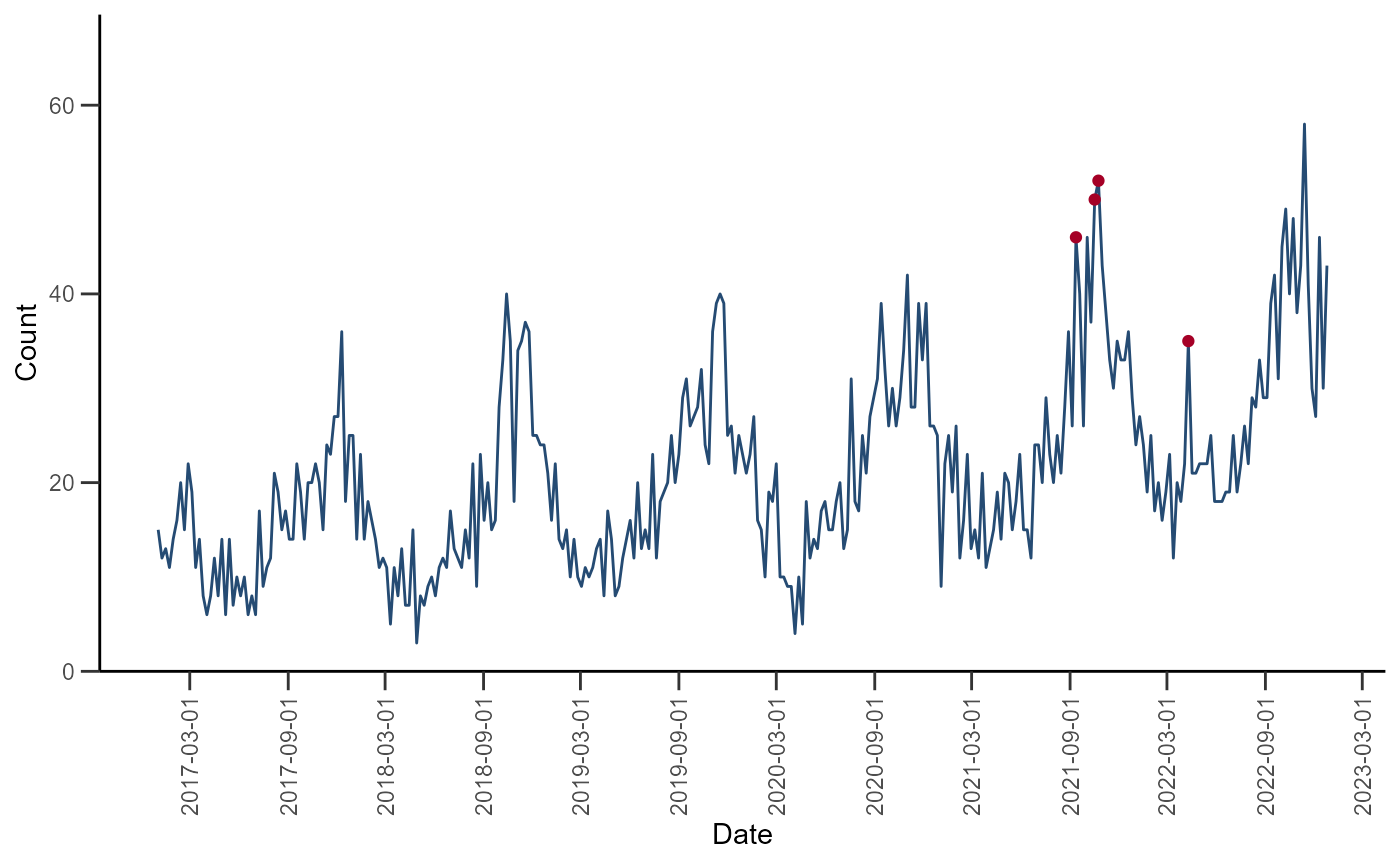
mutate(alert = factor(alert, levels = c("blue", "red", "grey")))Let’s visualize the time series with the detected anomalies:
ggplot(data = df_farr_modified) +
  geom_line(aes(x = date, y = cases), color = "#254B73") +
  geom_point(aes(x = date, y = cases, color = alert), show.legend = FALSE) +
  scale_color_manual(
    values = c("transparent", "#A50026", "transparent", "transparent")
  ) +
  scale_y_continuous(
    limits = c(0, NA),
    expand = expansion(c(0, 0.2)),
    labels = scales::comma,
    name = "Count"
  ) +
  scale_x_date(
    date_breaks = "6 month",
    name = "Date"
  ) +
  theme_classic() +
  theme(
    axis.text.x = element_text(angle = 90, vjust = 0.5),
    legend.position = "bottom",
    axis.ticks.length = unit(0.25, "cm"),
    legend.background = element_rect(color = "black", linewidth = 0.1)
  )
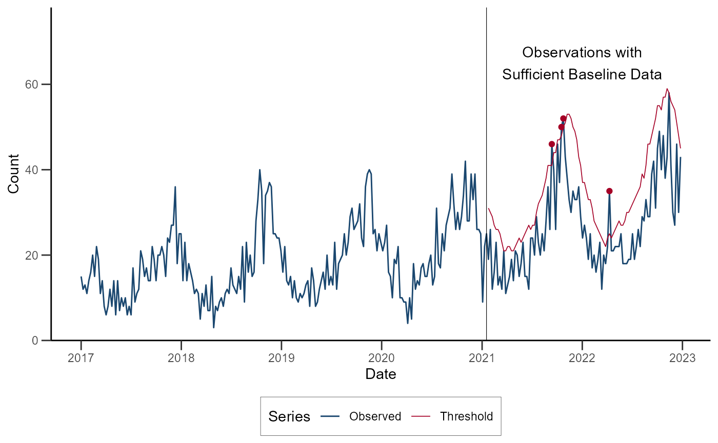
ggplot(data = df_farr_modified) +
  geom_line(aes(x = date, y = cases, color = "Observed")) +
  geom_line(aes(x = date, y = upper, color = "Threshold"), linewidth = 0.3) +
  geom_point(data = subset(df_farr_modified, alert == "red"), aes(x = date, y = cases), color = "#A50026") +
  geom_vline(xintercept = as.Date("2021-01-17"), linewidth = 0.2) +
  annotate(geom = "text", x = as.Date("2022-01-01"), y = 65, label = "Observations with\nSufficient Baseline Data") +
  scale_color_manual(
    values = c("#1A476F", "#A50026"),
    name = "Series"
  ) +
  scale_y_continuous(
    limits = c(0, NA),
    expand = expansion(c(0, 0.2)),
    labels = scales::comma,
    name = "Count"
  ) +
  scale_x_date(
    date_breaks = "1 year",
    date_labels = "%Y",
    name = "Date"
  ) +
  theme_classic() +
  theme(
    legend.position = "bottom",
    axis.ticks.length = unit(0.25, "cm"),
    legend.background = element_rect(color = "black", linewidth = 0.1)
  )
Negative Binomial Regression
The Negative Binomial Regression algorithm is intended for weekly time series spanning multiple years and fits a negative binomial regression model with a time term and cyclic sine and cosine terms to a baseline period that spans 2 or more years.
Inclusion of cyclic terms in the model is intended to account for seasonality common in multi-year weekly time series of counts for syndromes and diseases such as influenza, RSV, and norovirus.
Each baseline model is used to make weekly forecasts for all weeks following the baseline period. One-sided upper 95% prediction interval bounds are computed for each week in the prediction period. Alarms are signaled for any week during which the observed weekly count exceeds the upper bound of the prediction interval.
The Negative Binomial Regression detector can be applied with the
alert_nbinom() function (run
help(alert_nbinom) or ?alert_nbinom in the R
console for more).
The example below applies the Negative Binomial Regression detector to our synthetic time series for Scenario #1.
synth_ts1 <- simulated_data %>%
  filter(id == "Scenario #1")

df_nbinom <- alert_nbinom(
  synth_ts1,
  t = date,
  y = cases,
  baseline_end = as.Date("2021-12-26")
)
Let’s visualize the time series with the detected anomalies:
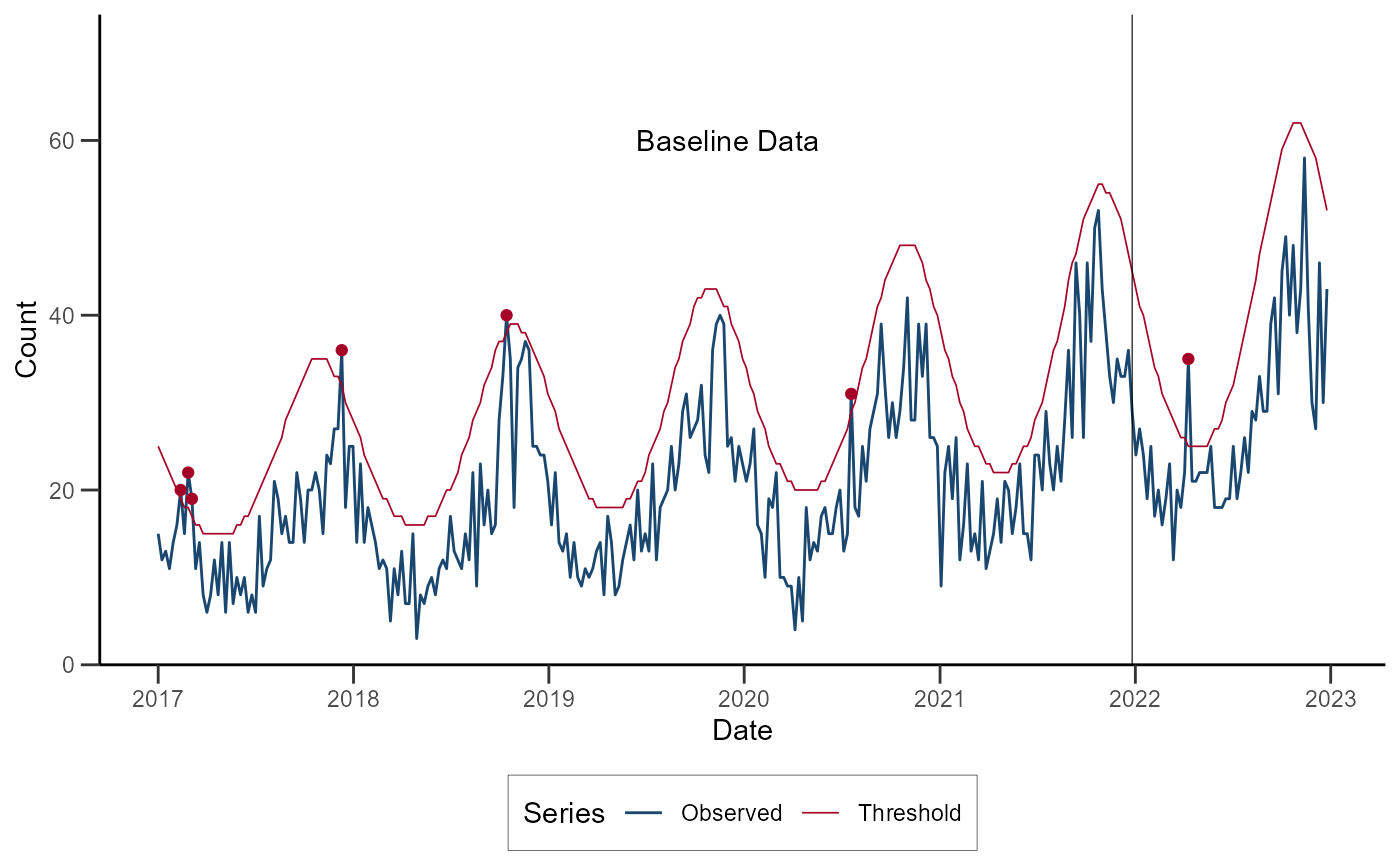
ggplot(data = df_nbinom) +
  geom_line(aes(x = date, y = cases, color = "Observed")) +
  geom_line(aes(x = date, y = threshold, color = "Threshold"), linewidth = 0.3) +
  geom_point(data = subset(df_nbinom, alarm), aes(x = date, y = cases), color = "#A50026") +
  geom_vline(xintercept = as.Date("2021-12-26"), linewidth = 0.2) +
  annotate(geom = "text", x = as.Date("2019-12-01"), y = 60, label = "Baseline Data") +
  scale_color_manual(
    values = c("#1A476F", "#A50026"),
    name = "Series"
  ) +
  scale_y_continuous(
    limits = c(0, NA),
    expand = expansion(c(0, 0.2)),
    labels = scales::comma,
    name = "Count"
  ) +
  scale_x_date(
    date_breaks = "1 year",
    date_labels = "%Y",
    name = "Date"
  ) +
  theme_classic() +
  theme(
    legend.position = "bottom",
    axis.ticks.length = unit(0.25, "cm"),
    legend.background = element_rect(color = "black", linewidth = 0.1)
  )
Original Serfling detector
The Original Serfling detector is intended for weekly time series spanning multiple years.
It fits a linear regression model with a time term and sine and cosine terms to a baseline period that ideally spans 5 or more years.
Inclusion of Fourier terms in the model is intended to account for seasonality common in multi-year weekly time series. This implementation follows the approach of the original Serfling method in which weeks between October of the starting year of a season and May of the ending year of a season are considered to be in the epidemic period. Weeks in the epidemic period are removed from the baseline prior to fitting the regression model.
Each baseline model is used to make weekly forecasts for all weeks following the baseline period. One-sided upper 95% prediction interval bounds are computed for each week in the prediction period. Alarms are signaled for any week during which the observed weekly count exceeds the upper bound of the prediction interval.
The Original Serfling detector can be applied with the
alert_serfling() function (run
help(alert_serfling) or ?alert_serfling in the
R console for more).
Using the same simulated time series from the previous examples, the Original Serfling detector can be applied as below:
df_serfling <- alert_serfling(
  synth_ts1,
  t = date,
  y = cases,
  baseline_end = as.Date("2021-12-26")
)
Let’s visualize the time series with the detected anomalies:
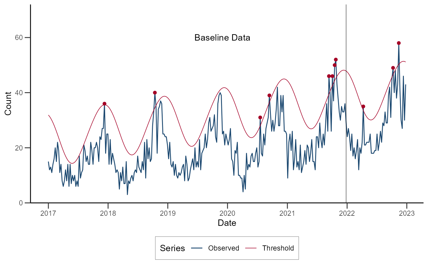
ggplot(data = df_serfling) +
  geom_line(aes(x = date, y = cases, color = "Observed")) +
  geom_line(aes(x = date, y = threshold, color = "Threshold"), linewidth = 0.3) +
  geom_point(data = subset(df_serfling, alarm), aes(x = date, y = cases), color = "#A50026") +
  geom_vline(xintercept = as.Date("2021-12-26"), linewidth = 0.2) +
  annotate(geom = "text", x = as.Date("2019-12-01"), y = 60, label = "Baseline Data") +
  scale_color_manual(
    values = c("#1A476F", "#A50026"),
    name = "Series"
  ) +
  scale_y_continuous(
    limits = c(0, NA),
    expand = expansion(c(0, 0.2)),
    labels = scales::comma,
    name = "Count"
  ) +
  scale_x_date(
    date_breaks = "1 year",
    date_labels = "%Y",
    name = "Date"
  ) +
  theme_classic() +
  theme(
    legend.position = "bottom",
    axis.ticks.length = unit(0.25, "cm"),
    legend.background = element_rect(color = "black", linewidth = 0.1)
  )
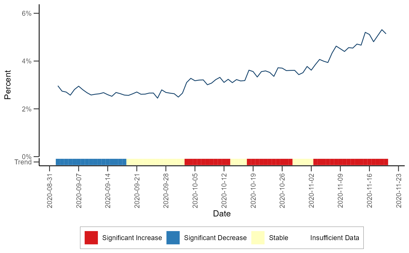
Trend Classification
The trend classification fits rolling binomial models to a daily time
series of proportions in order to classify local trend during the
baseline period as significantly increasing, significantly decreasing,
or stable. The algorithm can be performed via the
classify_trend() function (run
help(classify_trend) or ?classify_trend for
more). The test statistic and p-value are extracted from each individual
model and are used in the following classification scheme:
- p-value < 0.01 and sign(test_statistic) > 0 ~ “Significant Increase”
- p-value < 0.01 and sign(test_statistic) < 0 ~ “Significant Decrease”
- p-value >= 0.01 ~ “Stable”
If there are fewer than 10 encounters/counts in the baseline period, a model is not fit and a value of NA is returned for the test statistic and p-value
# Detecting trends in HHS region 4
data_trend <- classify_trend(df_hhs, data_count = dataCount, all_count = allCount)
Let’s visualize HHS region 4 trends with the color bar at the bottom representing the trend classification of each day over time:
# Filter the dataset
df_trend_region <- data_trend %>%
  filter(hospitaldhhsregion_display == "Region 4") %>%
  mutate(proportion = (data_count / all_count))

# Defining a color palette
pal <- c("#FF0000", "#1D8AFF", "#FFF70E", "grey90")

# Plot trend
ggplot(data = df_trend_region) +
  geom_line(aes(x = t, y = proportion), color = "#1A476F") +
  geom_xsidetile(aes(xfill = trend_classification, x = t, y = "Trend")) +
  scale_xfill_manual(
    values = c("#D7191C", "#2C7BB6", "#FFFFBF", "#DDDDDD"),
    drop = FALSE,
    name = NULL
  ) +
  scale_xsidey_discrete() +
  ggside(x.pos = "bottom") +
  scale_x_date(
    date_breaks = "1 week",
    name = "Date"
  ) +
  scale_y_continuous(
    limits = c(0, NA),
    expand = expansion(c(0, 0.2)),
    labels = scales::percent,
    name = "Percent"
  ) +
  theme_classic() +
  theme(
    axis.text.x = element_text(angle = 90, vjust = 0.5),
    legend.position = "bottom",
    axis.ticks.length = unit(0.25, "cm"),
    legend.background = element_rect(color = "black", linewidth = 0.1),
    ggside.panel.scale.x = 0.05
  )